Artwork Details
|
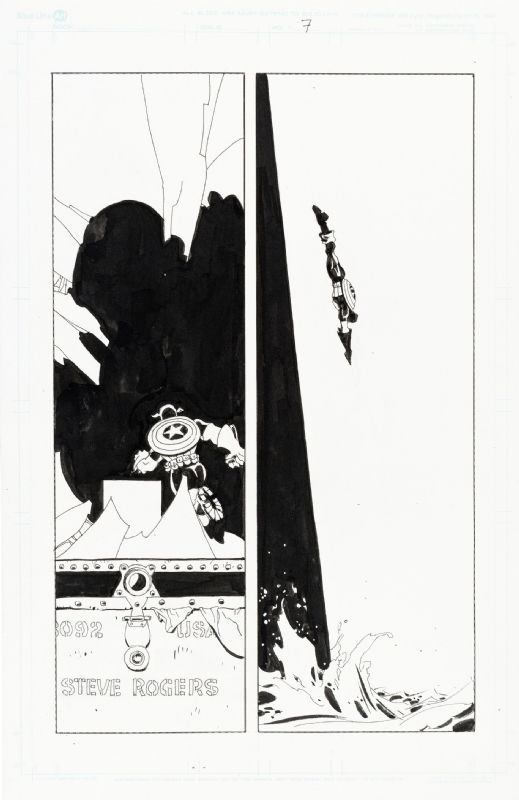
DescriptionAfter our glimpse of Cap staring at the foot locker on page five, here we get the reveal.This was the page I set my sights on when the preview images for the auction went up. Tim didn�t often use vertical panels, but when he did it was usually quite memorable. That�s certainly the case here. The right panel tries to steal the show thanks to eye-catching use of positive and negative space, but you also can�t help but appreciate how phenomenal the left panel is as well. Once again making great use of positive and negative space, Tim intentionally draws our attention to Cap by framing him in an inky pool surrounded by the white of the broken glass. It�s a brilliant compositional trick that ensures we don�t see the name on the foot locker until our eye finally makes its way to the bottom of the panel. And can we take a moment to appreciate the small touch of the lock clasp in the shape of a star that connects to what resembles a small, round shield on the foot locker? Brilliant! What a treat to be able to add this whole sequence to my collection. Social/Sharing |
About the Owner
|
Contact the OwnerUse can use a contact form to send an email to this gallery owner,
|
Comments on this Artwork
You must be logged in to make comments.
Steve . M ![]()
Member Since 2017
1 - Posted on 11/3/2023
Love how he spots his blacks on the right panel, not only does it draw the readers eye but the slightly askew angle helps give a sense of vertigo jumping from great heights
Marcus Wai ![]()
Member Since 2005
1 - Posted on 11/3/2023
A great escape and brings to mind espionage comics by Steranko with Fury going up those sheer cliff walls of Scorpio's lair in Shield #1.
Jared Michalski
Member Since 2004
1 - Posted on 11/3/2023
Marcus Wai wrote:
A great escape and brings to mind espionage comics by Steranko with Fury going up those sheer cliff walls of Scorpio's lair in Shield #1.��
Tim was a huge Steranko fan and this one clearly took some inspiration from his love for the man's work.
Kin Wong ![]()
Member Since 2007
1 - Posted on 11/3/2023
Congrats on putting a sequence of pages together! Love the left panel and how the black space kinda looks like a silhouette of someone trying to sneak up on Cap.
Brian Mulcahy ![]()
Member Since 2004
1 - Posted on 11/6/2023
This page is a master class in page design and composition.

Latest Updates
All |
|
Auctions ADVERTISEMENT
 |
Auctions
| Don Perlin and Brett Breeding The Transformers #26 |
Auctions
 |
FRANK FRAZETTA DEATH DEALER IV OIL PAINTING |
Auctions
 |
Dave Cockrum - X-Men #150 Cover |
Hakes Auctions
 |
JUDGE DREDD - 2000 AD PROG 197 COMIC MAGAZINE COVER ORIGINAL ART BY BRIAN BOLLAND. |


Subscribe to the YouTube Channel.. FREE!
2 Accepting Commissions
Commission an Artist
For Sale Updates
Classified Updates |
|
Rene Dorenbos9/7/2025 5:28:00 AM |
|
David H9/6/2025 9:51:00 PM |
|
Rugrat Spawn9/6/2025 5:47:00 PM |
|
Chris Dietzel9/6/2025 3:38:00 PM |
|
Peter Venkman9/6/2025 2:54:00 PM |
|
Will Gabri-El9/6/2025 12:52:00 PM |
|
Dealer Updates |
|
RomitaMan Original Art9/7/2025 2:23:00 AM |
|
NSN Art9/7/2025 12:01:00 AM |
|
TDArt Gallery9/6/2025 7:54:00 PM |
|
Anthony's Comicbook Art9/6/2025 3:57:00 PM |
|
Coollines Artwork9/6/2025 3:28:00 PM |
|
Will's Comic Art Page9/6/2025 12:52:00 PM |
|
|
|


