


|
Sabretooth Back To Nature Cover by Frank Teran
Artist: Frank Teran (All)
12 Comments - 567 Views - 15 Likes

Additional Images:

Published cover
Artwork Details
|
DescriptionA great and memorable cover (at least to me) devoted to one of the X-Men best villains/ frenemies: Sabretooth.Released as 48 pages prestige format one shot, one of many coming from the X-office during the 90s, this book blew my young mind from an aesthetical point of view. The story of a (X-Factor captive era) Sabretooth (and Wild Child) hunting a dangerous serial killer in the wild was nothing special but the art certainly was. If you thought Bisley ruled the 90s in terms of viciousness and violence with his art, there certainly was a contender in that department in then up and comer Frank Teran. He certainly was a better stylist than storyteller and yet for an artist emerging during the 90s, his storytelling was certainly apt and much better than some of the various Image studios clone artists. His style was perfectly suited to the character and subject matter. Never had Sabretooth been portrayed so ferociously, like the dangerous psychopath that he is. The main attraction is obviously our villain here. You have the prey in the background with his knife and some back in the wild elements. I�m usually not a big fan of the Sienkiewicz scritchy scratchy inking approach (complete with bursts of white out) but it works perfectly (for me) here. It certainly adds a layer of chaos to the piece. I love how he seemingly bursts off that black mass. The yellowish head is a stat but is thankfully glued on an acetate with the original art on the actual board. My guess is that Teran wanted to enlarge it a bit for publication. You can also find the logos and lettering on said acetate. Let me finish by saying that if you love(d) Frank Teran�s art in the 90s, there were 3 significant books in his career. The Alien one shot, the Sabretooth one shot and What if 87. He did some other works here and there (Batman, Punisher and Ka-zar) but these are the best books he produced IMHO. I can proudly state that I own his best cover work now as I also own the memorable Alien cover and because the published cover to What if 87 was mostly composed of stats. Clearly a guilty nostalgia pleasure but it packs quite the stylistic punch. Now to find a nail and frame for the bedroom, preferably the spot over the bed ^^ This is the eight day of my 2023 CAF birthday party. Social/Sharing |
About the Owner
|
Contact the OwnerUse can use a contact form to send an email to this gallery owner,
|
Comments on this Artwork
You must be logged in to make comments.
E DLS ![]()
Member Since 2005
1 - Posted on 2/13/2023
Not sure how I missed this one-shot. Did it come out before or after the Tex miniseries? In any case, looks so much nicer in black & white (emphasis on the black, LOL). Are you able to scan it without the overlay? I think it would be nice to see it both with and without the logos (and that yellow head). Anyway, great cover!
F M ![]()
Member Since 2005
Posted on 2/14/2023
E DLS wrote:
Not sure how I missed this one-shot.� Did it come out before or after the Tex miniseries?� In any case, looks so much nicer in black & white (emphasis on the black, LOL).� Are you able to scan it without the overlay?� I think it would be nice to see it both with and without the logos (and that yellow head).� Anyway, great cover!
The Tex mini was published '93 and this in '98.
The whole coloring of that book was atrocious, like the colorist didn't know what to do with Teran's art ;)
I'll try to add more pics without the overlay JUST for you ;)
Ruben DaCollector ![]()
Member Since 2008
1 - Posted on 2/13/2023
Well, color me surprised! I have never seen anything by Frank Teran other than some Punisher covers that have been posted here over the years, so I assumed he worked on that one title and then left the industry. I'm happy to see this now, however, as I like Sabretooth much more than I like the Punisher. While it hurts my soul to see you write such nonsense as "usually not a big fan of the Sienkiewicz scritchy scratchy inking approach (complete with bursts of white out)", I've decided to ask for forgiveness on your behalf. "Forgive him father, for he knows not what he sees with his own eyes!". Bottom line? This piece kicks an awful lot of ass!
F M ![]()
Member Since 2005
1 - Posted on 2/14/2023
Ruben DaCollector wrote:
Well, color me surprised! I have never seen anything by Frank Teran other than some Punisher covers that have been posted here over the years, so I assumed he worked on that one title and then left the industry. I'm happy to see this now, however, as I like Sabretooth much more than I like the Punisher. While it hurts my soul to see you write such nonsense as "usually not a big fan of the Sienkiewicz scritchy scratchy inking approach (complete with bursts of white out)", I've decided to ask for forgiveness on your behalf. "Forgive him father, for he knows not what he sees with his own eyes!". Bottom line? This piece kicks an awful lot of ass!
It’s just that I prefer my art with the pristine razor sharp inking look rather than having actual razors pasted on the board (à la Stray Toasters) ;p
So I do like Sienk’ but I’m not crazy about his art or that kind of approach.
But it seems that one can’t go against the consensus on CAF and express his own personal tastes anymore ^^
Duke Fleed aka #1 Groo Fan ![]()
Member Since 2013
1 - Posted on 2/13/2023
What a great score! Love the Inks!
Marcus Wai ![]()
Member Since 2005
1 - Posted on 2/14/2023
Teran was like a lot of the textural artists of the day. A complete opposite of the slick superhero style with the scratchy rough edged line that works best on vigilantes, outlaw types, and supernatural beings. His intent was to bring thought and and impact to the senses to sharpen your senses on this end of the artistic spectrum. For this Sabertooth cover, you can feel the mileage of savagery and the truly terrifying monster he has become on his own.
Jason Hussa ![]()
Member Since 2017
1 - Posted on 2/19/2023
Oooooh, wow - this is REALLY nice. Ferociously savage and a very dramatic composition with the other players staggered out behind Sabretooth here (even hidden behind the logo), more like a movie poster or album cover than a comic cover. I love the inking here, and how it helps the whole piece feel simultaneously UN-"natural" and absolutely accurate in its portrayal of Sabretooth's true "nature". REALLY great work. Big congrats, Fred, and the Day 8 birthday wish is "R!" :)
K Gearon ![]()
Member Since 2011
1 - Posted on 2/21/2023
Really dig the rough scratchy feel of this cover image...matches the subject matter perfectly. And those background inks really do serve to frame Creed here. Add the lettering up top and bottom and you've got a killer (pun!) image, indeed. Congrats!

Latest Updates
All |
|
Auctions ADVERTISEMENT
 |
Auctions
| Tom Sutton and Ricardo Villagr�n Star Trek #31 Sto |
Auctions
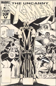 |
JOHN ROMITA JR. UNCANNY X-MEN #200 COVER (1985, "THE TRIAL OF MAGNETO!" ICONIC IMAGE OF THE 'NEW LOOK' MAGNETO IN CHAINS AND THE X-MEN IN BATTLE ON THIS MILESTONE COVER) |
Auctions
 |
Humberto Ramos - Edge of Spider-Verse #3 Variant Cover |
Hakes Auctions
 |
SECRETS OF THE LEGION OF SUPER-HEROES #3 COMIC BOOK COVER ORIGINAL ART BY DICK GIORDANO |


Subscribe to the YouTube Channel.. FREE!
 Scott's Collectables
1 Accepting Commissions
Commission an Artist
For Sale Updates
Classified Updates |
|
DISNEY COMIC ART A9/6/2025 9:13:00 AM |
|
P A9/6/2025 8:33:00 AM |
|
Rene Dorenbos9/6/2025 5:20:00 AM |
|
Monty B9/5/2025 3:53:00 PM |
|
Saxa Luna Galianan9/5/2025 1:01:00 PM |
|
Will Gabri-El9/5/2025 12:25:00 PM |
|
Dealer Updates |
|
Coollines Artwork9/5/2025 9:24:00 PM |
|
Koch Comic Art9/5/2025 7:54:00 PM |
|
Anthony's Comicbook Art9/5/2025 6:43:00 PM |
|
Will's Comic Art Page9/5/2025 12:25:00 PM |
|
Essential Sequential9/5/2025 12:15:00 PM |
|
Achetez de l'Art9/5/2025 12:15:00 PM |
|
|
Become a Premium CAF Gallery Owner & you'll be supporting CAF and also gain access to many services and features not available to standard members.
|