


IRON FIST VS. CAPTAIN AMERICA ILLUSTRATION BY JASON PEARSON
Artist: Jason Pearson (Penciller)
9 Comments - 387 Views - 14 Likes

Artwork Details
|
DescriptionThis is the last piece I secured from that other collector�s theme (Hi and thanks, Scott). I don�t recall if it was initially for sale during CAF live or if I deduced he was selling all of those themed commissions based on the ones I was seeing at auction and reached out to him because of it but this was one of the pieces that were on my to buy list that I immediately secured upon learning the news of Jason�s tragic passing.It�s another fun illustration by my favorite artist. As usual with Jason, the result is super dynamic and full of motion! I love how tense Iron First is, from his palmed hand, the energized fist, his grinding mouth to his extended kick, this is a fighter in full combat mode. It�s also fun to compare all the 3 recent pieces I uploaded to compare his body built. Jason�s is clearly the bulkiest version of all 3. It is also likely the closest the classic Byrne version. Lastly, I love how his dragon symbol looks like that of Batman if you supressed the head. His Cap is not a direct favorite version because we have been used a much leaner version of the character. But if you think about it, his iteration makes a lot of sense, much like Bart Sears� version (in the Cap & Falcon series). If you push the logic of the character to his fullest, you get a steroid uber jacked up soldier who should benefit from an enormous build and over developed jaw. Truth be told, I prefer the version of Cap Jason drew for my reinterpretation of Zeck Cap annual cover (that you can see in this very gallery) which was later produced and yet you can�t fault Jason for artistic consistency. Lastly, this one feels much more �open lined� than many of his much darker commissions and the use of light and shadows shine because of it (case in point, Cap�s bust being shadowed by his shield only). Great stylistic art (just look at all the fold in the clothes fabrics) by one of the very best to grace the comic field. May he be/drawing in/at peace. (Another one published in one of his sketchbooks btw) Social/Sharing |
About the Owner
|
Contact the OwnerUse can use a contact form to send an email to this gallery owner,
|
Comments on this Artwork
You must be logged in to make comments.
Ruben DaCollector ![]()
Member Since 2008
1 - Posted on 8/27/2024
I also am not a fan of this Cap, especially his head. It's so exaggerated that it looks more like an imposter in Cap's costume rather than Cap himself. Conversely, Iron Fist is a bit too skinny for my taste, which, juxtaposed against the massive Cap figure, makes the size disparity between them all the more exaggerated. But on the other hand, it's really interesting because the figure work and movement is really well done, as is the composition! So it's essentially a drawing featuring characters I love, displayed in stylistic interpretations I'm not a fan of, but drawn so well that I can't help but recognize how good of a drawing it is.Congrats on the acquisition of another Pearson piece to your collection!
F M ![]()
Member Since 2005
2 - Posted on 8/27/2024
Ruben DaCollector wrote:
I also am not a fan of this Cap, especially his head. It's so exaggerated that it looks more like an imposter in Cap's costume rather than Cap himself. Conversely, Iron Fist is a bit too skinny for my taste, which, juxtaposed against the massive Cap figure, makes the size disparity between them all the more exaggerated. But on the other hand, it's really interesting because the figure work and movement is really well done, as is the composition! So it's essentially a drawing featuring characters I love, displayed in stylistic interpretations I'm not a fan of, but�drawn so well that I can't help but recognize how good of a drawing it is.Congrats on the acquisition of another Pearson piece to your collection!
To be clear, while his version Cap is not love at first sight, it wins me over because it makes so much sense (with what the character is/should be).
Abraham Martinez ![]()
Member Since 2014
1 - Posted on 8/27/2024
Great piece!!!! Jason was an amazing artist, RIP
Ruben DaCollector ![]()
Member Since 2008
1 - Posted on 8/27/2024
Yes, no need for concern. You made that very clear in your description!
Kavi H ![]()
Member Since 2018
1 - Posted on 8/27/2024
Congrats on adding another Pearson piece to your collection!!! It goes really well with that last Canete piece, nice theme that collector had.
Andr� . ![]()
Member Since 2015
1 - Posted on 8/27/2024
Great energy in the movement, especially with Fist. Congrats!
Marcus Wai ![]()
Member Since 2005
1 - Posted on 8/27/2024
Pearson made a pretty fun contrast with the skinny kid of Iron Fist vs a used to be skinny kid in Steve Rogers. Danny would be more light on his feet while Steve looks like a tank with his armor and shield!
E DLS ![]()
Member Since 2005
1 - Posted on 8/27/2024
I loved Scott's IF collection. And he had some sweet Pearson pieces too. I remember this one very well. Congrats on being able to add it to your collection.
K Gearon ![]()
Member Since 2011
1 - Posted on 8/28/2024
Another IF vs Cap winner, and this by the late great JP. Great poses, composition, and inks. What else would we expect? Congrats!

Latest Updates
All |
|
Auctions ADVERTISEMENT
Auctions
| Milton Caniff Terry and the Pirates Daily Comic St |
Auctions
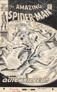 |
JOHN ROMITA AMAZING SPIDER-MAN #71 COVER (SOLD FOR $220K!) |
Auctions
 |
Dave Cockrum - X-Men #150 Cover |
Hakes Auctions
 |
SECRETS OF THE LEGION OF SUPER-HEROES #3 COMIC BOOK COVER ORIGINAL ART BY DICK GIORDANO |


Subscribe to the YouTube Channel.. FREE!
0 Accepting Commissions
Commission an Artist
For Sale Updates
Classified Updates |
|
David H9/6/2025 9:51:00 PM |
|
Rugrat Spawn9/6/2025 5:47:00 PM |
|
Chris Dietzel9/6/2025 3:38:00 PM |
|
Peter Venkman9/6/2025 2:54:00 PM |
|
Will Gabri-El9/6/2025 12:52:00 PM |
|
COMIX ART9/6/2025 11:30:00 AM |
|
Dealer Updates |
|
RomitaMan Original Art9/7/2025 1:16:00 AM |
|
NSN Art9/7/2025 12:01:00 AM |
|
TDArt Gallery9/6/2025 7:54:00 PM |
|
Anthony's Comicbook Art9/6/2025 3:57:00 PM |
|
Coollines Artwork9/6/2025 3:28:00 PM |
|
Will's Comic Art Page9/6/2025 12:52:00 PM |
|
|
Become a Premium CAF Gallery Owner & you'll be supporting CAF and also gain access to many services and features not available to standard members.
|