


ASTONISHING X-MEN 36 PAGE 11 BY JASON PEARSON AND KARL STORY
Artists: Jason Pearson (Penciller) , Karl Story (Inker)
230 Views - 3 Comments - 10 Likes

Artwork Details
|
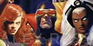
DescriptionThis a (too) rare Pearson occurrence in the X-Men world. At some point, Jason announced he would be tackling an X-men book. Monthly. I don�t know what reality was to be found behind that statement. If it was wishful thinking on his part or this was an actual editorial proposition/discussion that came his way. We will likely never know as it would prove difficult to verify. I don�t know either how realistic a concept it was given that this page comes from a 4 issues arc that Jason was to draw (and publicised as such) and of which he only drew a (magnificent) full issue and less than half of the second. Again, it may of course not have been entirely his fault as editorial like to play dangerous (scheduling) games sometime. We are only left with �what could have beens?�.This arc was called �Monstrous� and saw the X-Men tackles Fin Fang Foom and monsters from Monster island. Big dumb kaiju fun. And like always with Pearson, this page is a lesson in exceptional (cinematic) storytelling. The first panel sees a crew that just put foot on Monster Island looking for �something�. The sense of dread is palpable here with the trees and element of nature rendered in dangerous full blacks boxing in the soldiers with that warped angle. The worm view adds to the(ir) sense of disorientation. Lastly, seemingly oblivious to them, we see strange flying things above their heads. Danger comes from every side and corner. This is not a panel, this is a cage. The second panel see two soldiers looking at a radar like device in order to find what it is they are looking for. You can see from the guy on the left who is sweating like a pig that tension remains high. Then, bam! An exorcist type of flash scene in the third panel shows the big bad super villain of the story Mentallo. Let�s be honest, on paper, it would not theoretically seem easy to have Mentallo look dangerous. I would say that Pearson succeeded far and above here and that having him swallowed by the (negative space) blacks is a fantastic idea to make him look super creepy. It continues to slowly build the tension and the sense of uneasiness of the whole scene. Then BAM! the money shot! They have found what they were looking for or rather it has found them. A Gamera type of monster that is just too big to be contained by any panel frame (which is enhanced by how tiny the two heads at the bottom relate to its size). The way Pearson chose to render it with only part of it being delineated, only in cross hatching with no pupils is just sublime. The way the claws shatter the ground adds to the dangerosity of the scene and escalates the tension to the point that the reader has no choice but to turn the page. This, dear reader, is how you intelligently set up a horror movie sequentially on paper, away from the easy flashy and gory effects. It�s all about rhythm, building tension and releasing it with one big graphic image. This page may have no x-men on it and yet it�s probably my fav� of the whole issue (where no bad page can be found, incidentally). (Let�s not forget to mention the absolute pristine inks of Karl Story here. Yes, this is a scan but that page actually looks like this. Not a visible drop of inks on the page which is insane.) What a monster of an artist Jason was (pun intended). Draw in peace. Social/Sharing |
About the Owner
|
Contact the OwnerUse can use a contact form to send an email to this gallery owner,
|
Comments on this Artwork
You must be logged in to make comments.
Kavi H ![]()
Member Since 2018
1 - Posted on 5/20/2025
Congrats on a rare X example from your favorite artist. I really like the perspective/lense on the first panel and the deep rich blacks of the third before the kaiju pops out at the end of the page. Very nice looking sequence of storytelling per everything you mention. I didn't even realize he worked on the title or potentially had discussions to do more X-Men work to be honest, what could have been indeed...
Marcus Wai ![]()
Member Since 2005
1 - Posted on 5/20/2025
The contrast between the last two panels is so jarring. Imagine if it was a movie cut edit from pitch black to pure white that would blind you and you'd only see the just parts of the monster.
Ruben DaCollector ![]()
Member Since 2008
1 - Posted on 5/21/2025
The establishing shot is really nice and the rendering in the final panel is very well done and effective. I have no recollection of Pearson having ever been announced as the artist, much less that he ever worked on the title at all. But given the way his career unfolded and the fact that by this point in the series, most fans no longer cared much for this title, I suppose that's to be expected. I agree that when you look at this and know that he drew less than one and a half issues, it's easy to wonder what might have been. The sad part is that the same thing could be said about his entire career, and that's the real shame.
Latest Updates
All |
|

Auctions ADVERTISEMENT
 |
8,5x11" RED SONJA SK#3630 ORIGINAL PINUP GIRL by ALEX MIRANDA |
Auctions
| Richard Burchett and Terry Austin Superman Adventu |
Auctions
 |
BARRY WINDSOR-SMITH MARVEL COMICS PRESENTS #79 COVER (SOLD FOR $320K) |
Auctions
 |
Jack Kirby - Journey Into Mystery #86 - Thor, Page 8 |
Hakes Auctions
 |
GHOSTS #82 COMIC BOOK COVER ORIGINAL ART BY LUIS DOM�NGUEZ. |


Subscribe to the YouTube Channel.. FREE!
 3 Wishes
21 Accepting Commissions
Commission an Artist
For Sale Updates
Classified Updates |
|
Robert Hughes1/23/2026 7:28:00 PM |
|
Monty B1/23/2026 5:37:00 PM |
|
Mugen R.1/23/2026 4:52:00 PM |
|
ComicLINK.Com Auctions1/23/2026 4:47:00 PM |
|
NELSON H1/23/2026 3:11:00 PM |
|
ENRIQUE ALONSO1/23/2026 2:36:00 PM |
|
Dealer Updates |
|
RomitaMan Original Art1/24/2026 4:30:00 AM |
|
Coollines Artwork1/23/2026 9:53:00 PM |
|
Koch Comic Art1/23/2026 7:20:00 PM |
|
Anthony's Comicbook Art1/23/2026 4:51:00 PM |
|
ComiConArt1/23/2026 3:57:00 PM |
|
Catskill Comics1/23/2026 2:15:00 PM |
|
|
Become a Premium CAF Gallery Owner & you'll be supporting CAF and also gain access to many services and features not available to standard members.
|