F M BELGIUM
Member Since May 2005
2902 Artworks | Watched by 147

Marvel Comics Presents 136 Story Page 4 half splash (feat’ Wolverine) by Steve Lightle

Location: LIGHTLE STEVE
Artist: Steve Lightle (All)

372  Views  -  13  Comments  -  14  Likes

Additional Images

Published page
Artwork Details
Location: LIGHTLE STEVE
Title: Marvel Comics Presents 136 Story Page 4 half splash (feat’ Wolverine) by Steve Lightle
Artist:  Steve Lightle (All)
Media Type: Pen and Ink
Art Type: Interior Page
For Sale Status: NFS
Views: 372
Likes on CAF: 14
Comments: 13
Added to Site: 1/8/2024

Share This Artwork
Description
Today marks the 3 years “anniversary” of Steve Lightle’s untimely passing, so I thought appropriate to share this fantastic half splash of MCP featuring Wolverine, for which Steve drew several serials as well as many memorable covers.

Steve was experimenting with his style during that period, throwing more inks as well as some scratchiness at his pages which remained unmistakably his.

The first half splash of a panel is the obvious incentive with Wolvie having a go at Cyber (remember him?). I love the pose Steve went for here as well as the fact that Wolvie is short like he is supposed to be. His Wolvie is also super bulky and I love the near absence of a neck, making him look like a pit-bull. That young girl is also nice to look at but just take notice of the incredible backgrounds here. That temple IS made of stones and those villains storming its gates & guards are another great storytelling element. Finally, let’s take notice of the great use of shadows all over, from the temple to that column casting a shadow that leads the eye from the right to the left towards the second panel, the splatter vaporous like effect surrounding the two fighters. A great if busy composition that still reads fluidly despite all the information.

Then we have a great close up on the beautiful girl (despite her “hu-oh” moment) as she is getting caught by the two villains. Those are typical Lightle designs, especially the one fully clothed in black. I love how Steve use some negative space to delineate his costume folds and to focus the attention of the reader on the fact that he is grabbing the girl’s hand. A small panel in which the use of perspective plays well into both leading the reader’s eye and cramming as much info as can be despite its size.

Then a 3 panels sequence in which the villain is submitting the poor girl. The change of camera angles makes for a dynamic read and there are many great elements in each. Like the girl’s spot on expression of reluctance in the 3rd, again the negative space delineating the bad guy’s costume, from the fold of his cape into his mask in the 4rth and the extreme close ups on both characters in the 5th which is spot on. The guy looks menacing as hell despite the absence of features and her reaction is perfect. Great brushy inks on her hair throughout.

Worth noting, on top of (an early) Dan Slott writing, is that both Steve and his wife Marianne coloured that story, so it is as close a Steve’s full artistic vision as it can get.

About The Owner

Thank You For Supporting CAF!
F M
Badges: Premium Gallery Owner
Member Since: May 2005
Last Login: April 2026
Country: BELGIUM
On CAF:
F's Classifieds
Artworks Commented On
Liked Art
Site Activity
Contact F M

Login or register for an account to email the owner of this artwork.

Comments on this Artwork

You must be logged in to make comments.
Steve Lipsky Member Since 2008
1    
Posted On 1/8/2024

Congrats on this gorgeous piece!  Steve's work was so intricate and beautiful.  It didn't even need color.  We need more artists like him.  RIP Steve, you are missed.

Peter Sullivan Member Since 2006
1    
Posted On 1/8/2024

Always liked Steves stuff. Wonderful sense of design.

Ruben DaCollector Member Since 2008
1    
Posted On 1/8/2024

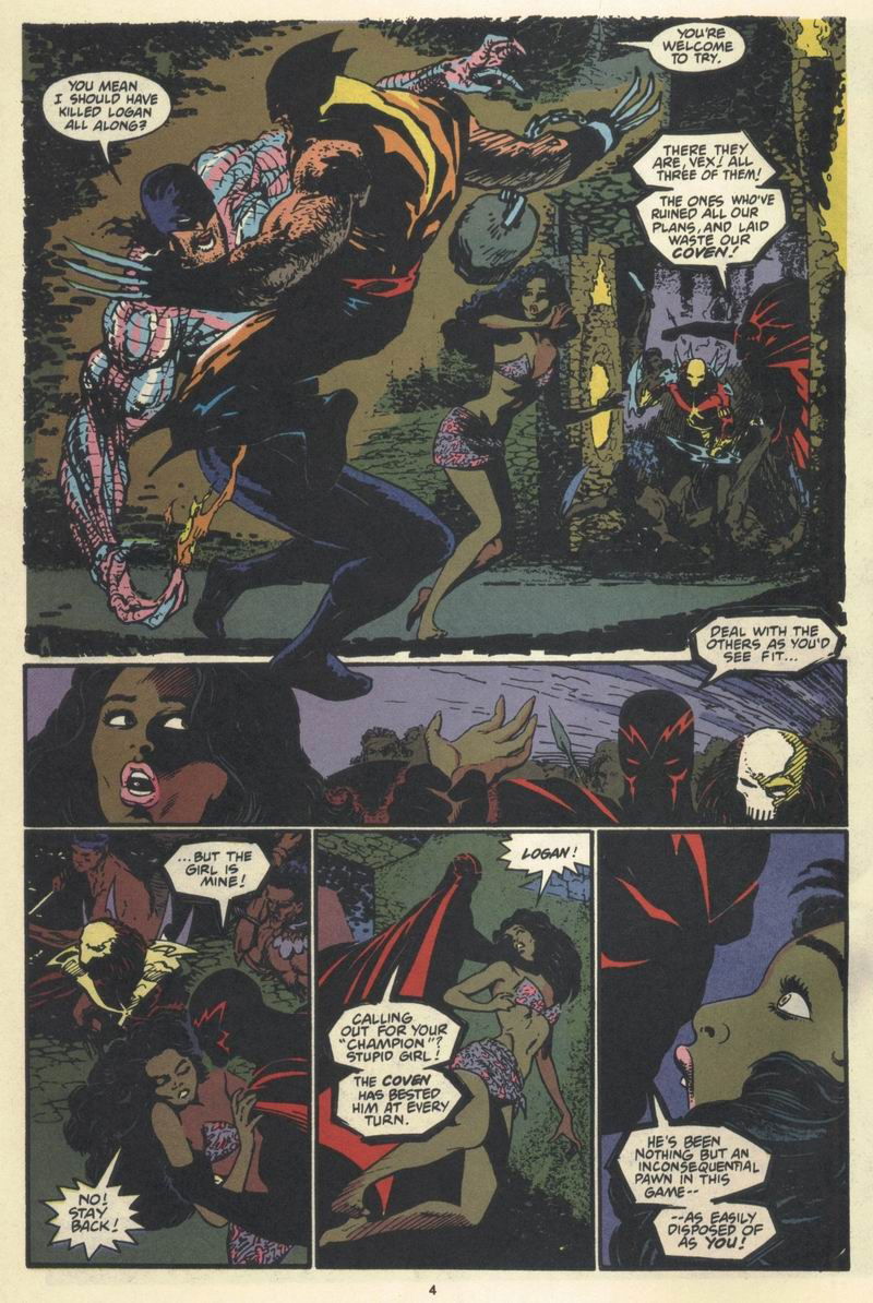
An immense talent taken away far too soon. Though this era was already the point at which most fans began disliking his experimental change in style, it is still unmistakably Lightle's. I just have to say that my biggest takeaway from this page is the absolute abundance of textures. There are so many different ones all over this page, tons of them in the first panel alone! I also love that he autographed the page in the same stylized way that he signed his covers. As for Dan Slott, he should've known better! Ugh....

André . Member Since 2015
1    
Posted On 1/8/2024

The printed version does not do his inks justice. Lovely piece. 

Marcus Wai Member Since 2005
1    
Posted On 1/8/2024

Looks like Lightle made it more condensed on the page choosing this panel size as well with the art and textures already so dense.  He puts a lot of 90's high enegy in this, but keeps the line for the lady light and delicate.  

Steve Day Vich Member Since 2007
1    
Posted On 1/8/2024

I'm happy to find out that this exists today. 

Shelton  Bryant Member Since 2005
1    
Posted On 1/9/2024

Brilliant and Slashing Inks!! Luv the Cut-Throat Style!!!.......Congrats!!

Jason Hussa Member Since 2017
1    
Posted On 1/9/2024

Another fantastic Lightle, F M, and although that killer first panel has a -pitch perfect- depiction of a Wolverine battle moment that hijacks the viewer's attention (Wolvie totally in Cyber's face, absolute animal-like ferocity, all close quarters brawler, completely undeterred by the size differential), it's the backgrounds on that one that are the star of the show. Amazing detail in the bricks and stonework; beautiful patterns and lighting (way more work than he needed to do!) with the lighting on the second-level platform being the highlight (allowing Wolverine's right hand claws to stand out and not be lost amidst the stonework).  Great detailing through the rest of the page, too (I really am taken with the sweep of the woman's hair in the last panel, as well as the sweep of the villain's cape in the panel before - giving a nice lighting balance).  Lovely tribute to the very fine work of Steve Lightle, F M.  Beautiful piece. 

James Dornoff Member Since 2019
1    
Posted On 1/9/2024

Great page to honor Steve.  

Tyler T Member Since 2020
1    
Posted On 1/10/2024

Outstanding page! Always great to see a Wolvie Cyber battle :)

K Gearon Member Since 2011
1    
Posted On 1/10/2024

First thing I thought is that it's a really unique looking page.  Those gritty inks up top, with characters breaking panel, then the shadowed figure...hard to explain but all blends for a visually pleasing page, man.  So yeah, I don't have the words :)  Congrats!

Bill J Member Since 2009
1    
Posted On 1/18/2024

Gorgeous page by Steve Lightle! It's always sad when we lose someone with some much talent as Lightle. Unlike some, I always appreciated his willingness to experiment with style and try new things in his art. Love that top panel with Wolvie tacking Cyber! I love how Logan is drawn small and muscular here. I also love the treatment of the background. The textures that Lightle used here are really interesting. The heavy use of black on this page is really quite striking. Great pick-up, congrats!

levi jacob Member Since 2007
1    
Posted On 3/9/2024

Wonderful page by a wonderful artist.

You must be logged in to make comments.