Log In Register
Brian Coppola UNITED STATES
Member Since March 2009
3455 Artworks | Watched by 75

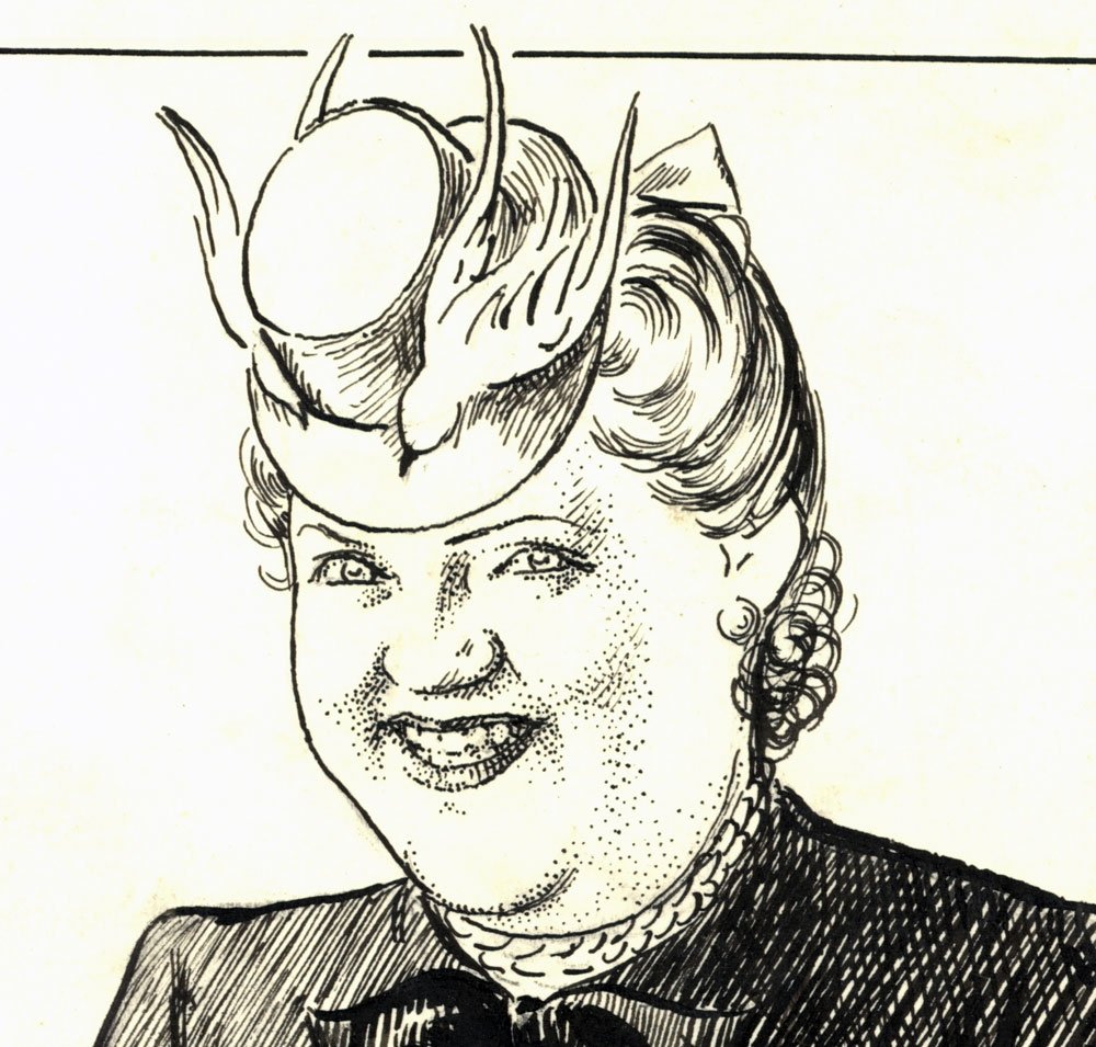
“Know them By Their Hats.” (Among Us Mortals, 09/17/1944) by W.E. Hill

Location: Among Us Mortals
Artist: WE Hill (All)

876  Views  -  2  Comments  -  1  Likes

Additional Images

detail

detail

detail
Artwork Details
Location: Among Us Mortals
Title: “Know them By Their Hats.” (Among Us Mortals, 09/17/1944) by W.E. Hill*
Artist:  WE Hill (All)
Media Type: Pen and Ink
Art Type: Illustration
For Sale Status: NFS
Views: 876
Likes on CAF: 1
Comments: 2
Added to Site: 1/4/2020

Share This Artwork
Description
“Know them By Their Hats.” (Among Us Mortals, 09/17/1944)
by W.E. (William Ely) Hill (1887-1962)
18.5 x 15 in., ink on board

W.E. (William Ely) Hill (1887-1962) was known for his masterful black and white Sunday page, “Among Us Mortals,” sometimes referred to as the Hill Page. Please see the Gallery description for more about Hill.

From this September 17, 1944 edition, titled “The Liquor Drought,” some quotes:

“The Cutie. This headgear is a favorite with the girl who is almost too cute to let live. The kind who says, “Don’t I say the CRAZIEST things!”

“The rakish angle. Watch out girls, this means “Wolf!” “

About The Owner

Member Since: March 2009
Last Login: July 2026
Country: UNITED STATES
On CAF:
Premium Member Q&A
Artworks Commented On
Liked Art
Site Activity
Contact Brian Coppola

Login or register for an account to email the owner of this artwork.

Comments on this Artwork

You must be logged in to make comments.
Aidan (Re-Legion ) Lacy Member Since 2005
Posted On 1/4/2020

This is just a fun fun piece !! I need to revisit my "cheapeau" days

Brian Coppola Member Since 2009
Posted On 1/4/2020

Aidan (Re-Legion ) Lacy wrote:
"  This is just a fun fun piece !! I need to revisit my "cheapeau" days
 "

The linework in these pieces blows me away. The originals are huge, and you can see the level of detail in the close-ups. You look at a bled-ink on newsprint copy of how people saw these and the difference is boggling. It surely looked good in print, in a relative sense, because losing 30% of something that was done at 150% performance is still great.