
30 Results

Yep, it's the VS System card "Power Armor."
https://res.cloudinary.com/csicdn/image/upload/v1/Images/Products/VS%20System%20Art/Worlds%20Finest/full/DWF203.jpg

It is! I was fortunate to get it from a very nice collector. :)


Big fan of this one! Reminds me of the JLU episode "Shadow of the Hawk." Always cool to see a crisply-inked Shadow Thief!

Love the relection in the hood! The fact that Tom works so big for a piece that will end up being 2" by 1.5" makes the details such a fun revelation when you see the original. It perfectly captures a pivotal moment from a seminal Batman story. What more can you ask for?

Awesome pick-up, Bran! Love Robinson's inks and the details like the texture of the metallic arms or the hair on Bishop's really stand out on such a simple composition. Good stuff!

I collect VS System art and this is probably the first piece I've seen with an extensive remarque.
If you ever decide to sell, please keep me in mind!

Thanks JN!
I love how you can see Ariel working out Joker's face in the background. I think the profile angle he went with is more interesting and gives that great sense of duplicity.

Hey John! I would say the inking is pretty superb as well. ;)

Awesome piece! Sorry I missed it, but always glad to see more VS art on CAF. Kevin Nowlan perfectly captures the card title with this one!

Thanks Paul! I got this from one of the weekly shows that Neal did with his family and I thought they were a lot of fun, especially his stories before the auction started.
I know color guides aren't in the same tier as original pencils, but it's nice to have a few extra pieces that Neal put his hand to.

Yeah it's striking in stark pen and ink. It feels like he's carved out of living marble. Very appropriate for the character. I much prefer it over the published piece.

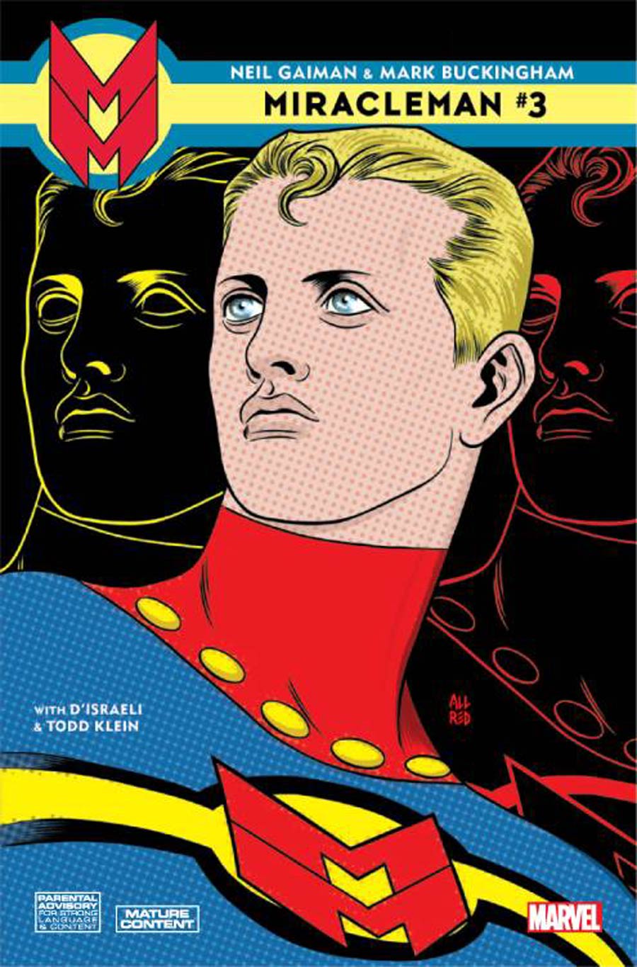
Yeah you said it, Marcus! I think Hitch's is one of the best of the reprint covers. The vast hand-drawn city just gives Miracleman such a great sense of scale. And of course I always love seeing MM drawn with the classic twinkling trail of stars.

Thanks David! This is actually a prelim, but I think the pose is more striking than the final.

Yeah John filled it with so much intensity with the expressions alone. I also like all the subtle hair and costume differences that capture that multiversal feel.

Yeah I agree, Gal! I love the sense of speed that Alessandro imbued with the color blur on both Wally and the background. I honestly think it's more dynamic than the Identity Crisis panel it's recalling.

Yeah I love McGuinness' big, bold style! As with all the pieces in this gallery, it was used on a VS System card.
At some point I'll need to properly scan in the associated cards and add them as additional images.


Absolutely! The foreshortening and Pym's hand breaking out of the frame really does make him feel like he's towering over me, as the card name suggests!

Yeah one of the things I love about collecting card art is that you can get such great renditions of key moments without taking out a second mortgage!
I am a bit bummed that the ink or marker Kevin Maguire used has started to purple so much already. It's true of all three pieces I have from him. I know that's a problem with older art but I don't feel like it comes up as much with modern stuff.

Yeah when I first saw the piece, I had to stop and orient myself for a second.

Agreed, Eric! This is one where I think the black and white looks better than the color. The value on the hair especially gives the piece a great sense of lighting even without a background. Such a great menacing vibe. Nowlan did a few other cards that I'd love to add to my collection.

I think it was a brilliant move to have the only visible eyes in the piece be Dr. Light's tortured ones. I also love the contrast between doc's wrinkled cape and Zatanna's pristine cloak.
This is also my biggest piece, with an image size of 15"x15". Plenty of space for Craig to infuse with detail, as you say.

Agreed. This was actually the second piece I acquired overall and it set the bar high! I think it's one of Cully Hamner's best.

Sue and Ben's faces say it all! I only learned a few days that "collectors love brick." So funny to hear it on this piece now. Thanks Marcus!

Absolutely, Marcus! The image area is 12"x12", so it doesn't even completely fit on my A3 scanner bed. Absolutely jumps off the page in-person. I can sadly only capture the barest essence of it digitally.

That's certainly how I felt when I got this piece from Tom, Marcus! He shines like a beacon in the deep.

Thanks! I love Alessandro's barrel-chested Big Red Cheese and I agree he absolutely pops against that sky!
And yeah the prelims are impressive in their own right. I was tempted to showcase them as separate posts. Still sort of figuring out what works better.

Thanks Eric! This is possibly my favorite piece that I own so I'm glad it resonated with you, too.
Craig's colored pencils just seem to glow on the page. The Joker's candy coloration makes him feel almost edible!
I think the canted angle and the foreshortened cage give a great sense of height to an image that needs to read on a 1.5"x2" card art window!

Of the roughly 4,300 pieces of art done for the VS card game, this has to be my favorite. Perfectly captures the hope and power of the man of steel.
If the lucky owner ever wants to sell, hit me up.
