Scott Williams inks on Neal Adams Batman
Artists: Neal Adams (Penciller) , Scott Williams (Inker)
9 Comments - 5,439 Views - 0 Like
Artwork Details
|
DescriptionA rare simple page from the issue. Neal packs a lot in these pages so it was nice to get a breather with this page. I thought I was starting to get what Neal was going for on this page, but unfortunately the first panel of Bruce and Alfred was re-inked by Neal in the printed comic.Social/Sharing |
About the Owner
|
Contact the OwnerUse can use a contact form to send an email to this gallery owner,
|
Comments on this Artwork
You must be logged in to make comments.
Will K ![]()
Member Since 2006
Posted on 10/13/2010
Batman in the 2 lower panels is probably the closest I've ever seen to a vintage Batman Adams in modern times. Just a guess but maybe the modern Adams is conflicted between how to interpret his own pencils. From the samples displayed, I think you've been as faithful to the pencils as vintage Giordano could have been but maybe not as exacting as vintage Adams inking would have been. Great job.
Ben Herman
Member Since 2003
Posted on 10/13/2010
I always enjoy viewing "before and after" examples such as these. For instance, I think this particular page really demonstrates the subtle yet important impact the inker has upon the final look of the artwork.
J P
Member Since 2007
Posted on 10/14/2010
Nice. Interesting change in the girl's eyes in the penultimate panel. In the pencil version she seems to be looking at the picture and in the inked version she's looking at batman.
Bob McLeod ![]()
Member Since 2005
Posted on 10/14/2010
While I think most of what you're doing is wonderful (one of the things I've always loved about Neal's own inking is the playfulness of his lines, and you also have that quality) Alfred's jaw in the top panel is an example of where I think you over-render and misinterpret Neal's anatomy. By placing the dark where you did, you moved the jaw bone lower and out of place. By rendering so much, you create a grey that bleeds into Batman's mask in the panel below it, flattening the depth. Neal's pencils had a white against black which separates the two heads much better, and his jawbone rendering has a simple elegance that all your rendering can't match. While your technical proficiency is magnificent, Dick Giordano (who several people are comparing this stuff against) always strengthened areas like this with strong contrast rather than weakening them with grey.
Rob Pistella ![]()
Member Since 2005
Forum Moderator
Posted on 2/20/2011
Bob McLeod wrote:
While I think most of what you're doing is wonderful (one of the things I've always loved about Neal's own inking is the playfulness of his lines, and you also have that quality) Alfred's jaw in the top panel is an example of where I think you over-render and misinterpret Neal's anatomy. By placing the dark where you did, you moved the jaw bone lower and out of place. By rendering so much, you create a grey that bleeds into Batman's mask in the panel below it, flattening the depth. Neal's pencils had a white against black which separates the two heads much better, and his jawbone rendering has a simple elegance that all your rendering can't match. While your technical proficiency is magnificent, Dick Giordano (who several people are comparing this stuff against) always strengthened areas like this with strong contrast rather than weakening them with grey.Hey Bob, will all due respect, I think these types of 'professional critique' type comments ought to be made in private. It isn't appropriate here.
- Artemaria
Member Since 2007
Posted on 3/5/2011
Bob McLeod wrote:
While I think most of what you're doing is wonderful (one of the things I've always loved about Neal's own inking is the playfulness of his lines, and you also have that quality) Alfred's jaw in the top panel is an example of where I think you over-render and misinterpret Neal's anatomy. By placing the dark where you did, you moved the jaw bone lower and out of place. By rendering so much, you create a grey that bleeds into Batman's mask in the panel below it, flattening the depth. Neal's pencils had a white against black which separates the two heads much better, and his jawbone rendering has a simple elegance that all your rendering can't match. While your technical proficiency is magnificent, Dick Giordano (who several people are comparing this stuff against) always strengthened areas like this with strong contrast rather than weakening them with grey.Please keep these types of comments coming, they are insightful and add to the discussion. Your informed opinion about the inking process, posted here in public for all to see is one of the things that makes CAF such a wonderful place to look at and learn about comic art. Thanks for sharing.
Brian Monroe
Member Since 2004
Posted on 3/5/2014
- Artemaria wrote:
Please keep these types of comments coming, they are insightful and add to the discussion. Your informed opinion about the inking process, posted here in public for all to see is one of the things that makes CAF such a wonderful place to look at and learn about comic art. Thanks for sharing.i agree. no one is questioning scott's mastery of inking. he himself has admitted to having issues nailing neal's approach. all in all he did an admirable job. i do not envy the challenge and pressure he was/is under from fans and pros alike. we're all adults here, bob said nothing vulgar.
jason millet
Member Since 2007
Posted on 10/14/2010
I love the contributions Bob McLeod, as a veteran of the classic Continuity days, is making-- maybe Bob could interview Neal and Scott for an upcoming issue of Draw Magazine? Scott- thanks so much for sharing these before-and-afters. I'd love to see all the pages that you worked on. This is fun!

Latest Updates
All |
|
Auctions ADVERTISEMENT
 |
Auctions
| Freddie Williams II The World According to Thor St |
Auctions
 |
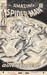
JOHN ROMITA AMAZING SPIDER-MAN #71 COVER (SOLD FOR $220K!) |
Auctions
 |
Tom Lyle - Amazing Spider-Man #431 Cover - Silver Surfer as Cosmic Carnage! |
Hakes Auctions
 |
JUDGE DREDD - 2000 AD PROG 197 COMIC MAGAZINE COVER ORIGINAL ART BY BRIAN BOLLAND. |


Subscribe to the YouTube Channel.. FREE!
12 Accepting Commissions
Commission an Artist
For Sale Updates
Classified Updates |
|
Rick Verbanas9/7/2025 9:50:00 AM |
|
Peter Venkman9/7/2025 9:25:00 AM |
|
* HoxtonArcade9/7/2025 6:48:00 AM |
|
Rene Dorenbos9/7/2025 5:28:00 AM |
|
David H9/6/2025 9:51:00 PM |
|
Rugrat Spawn9/6/2025 5:47:00 PM |
|
Dealer Updates |
|
RomitaMan Original Art9/7/2025 2:23:00 AM |
|
NSN Art9/7/2025 12:01:00 AM |
|
TDArt Gallery9/6/2025 7:54:00 PM |
|
Anthony's Comicbook Art9/6/2025 3:57:00 PM |
|
Coollines Artwork9/6/2025 3:28:00 PM |
|
Will's Comic Art Page9/6/2025 12:52:00 PM |
|
|
|


