|
Photon (from Youngblood) pin up by Cully Hamner
Artist: Cully Hamner (Penciller)
6 Comments - 545 Views - 2 Likes
Artwork Details
|
DescriptionA fantastic early pin up of Photon (from Yougblood) from Cully Hamner.This is labelled as inventory but was actually published as part of a pinup gallery in Team younglbookd 12 😉 Many things attracted me to this piece. For one, it was a transitional period for Cully as even though he debuted strongly in the industry (GL Mosaic era), he was still rough around the edges. But like all of his Gaijin Studio peers, his learning/growing curve was exceptionally fast in terms of the quality of the work produced. This piece is far ahead of the quality he produced on GL a year or two before. Then (if memory serves) Cully�s training as an architect really shines here with incredibly detailed and packed backgrounds that remain totally readable. So is the perspective which is completely mastered. The figure itself is bolder and really pops from the backgrounds. This is probably due to a change of style. The buildings are drawn with precise academic precision whereas Photon is drawn in a more cartoony way which is still in tone with Cully�s figure work on Mosaic. I find that his red energy trail really makes the piece pops. So does the effect on the smoke on the grounds between the buildings. The kind of gritty, dusty effect you would find nowadays in Harren or DWJ�s work. Lastly, I find that the piece has a strong (original) Firestorm vibe. I mean Photon was obviously inspired by Firestorm�s design but this goes beyond that. I find that this piece�s layout and strong backgrounds really has the same kind of vibe you could find on the covers of the title during the Kayanan or Broderick era of the run. This one sat on ebay with a price that I thought was too much for an unpublished piece. Then it disappeared to later pop during a C-Link catch all monthly auctions where I was able to buy it for a fraction of the original asking price. Social/Sharing |
About the Owner
|
Contact the OwnerUse can use a contact form to send an email to this gallery owner,
|
Comments on this Artwork
You must be logged in to make comments.
Filmore W. Bedwick
Member Since 2003
1 - Posted on 10/18/2020
Awesome work! Great figure with exceptional perspective and love the red!
J H ![]()
Member Since 2019
1 - Posted on 10/18/2020
I agree with everything in your write-up. The differing styles between the figure and background make the figure really stand out and creates depth. Same with the use of red. Aside from making a splash page, Cully seemed to be trying to make a balanced piece of art by itself for a collector. Very nice work. Congrats!
Witchblade collector ![]()
Member Since 2018
1 - Posted on 10/23/2020
This is a great perspective. Congrats
K Gearon ![]()
Member Since 2011
1 - Posted on 11/20/2020
Nice! I like all of things you pointed out. Right away you feel that sense of movement with the perspective ("wow" on those buildings) and sense of depth. It's also cool how red ink was used at times in images and that's perfect here as it provides just a hint of color for his flame trail. Congrats!

Latest Updates
All |
|
Auctions ADVERTISEMENT
 |
Auctions
| Scott Koblish [Wayne Nichols printed lines] Exiles |
Auctions
 |
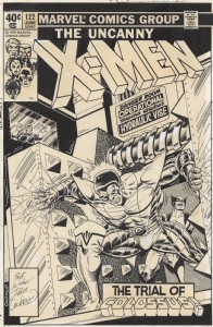
DAVE COCKRUM AND TERRY AUSTIN X-MEN #122 COVER (SOLD FOR $250K) |
Auctions
 |
Humberto Ramos - Edge of Spider-Verse #3 Variant Cover |
Hakes Auctions
 |
JUDGE DREDD - 2000 AD PROG 197 COMIC MAGAZINE COVER ORIGINAL ART BY BRIAN BOLLAND. |


Subscribe to the YouTube Channel.. FREE!
2 Accepting Commissions
Commission an Artist
For Sale Updates
Classified Updates |
|
Rene Dorenbos9/6/2025 5:20:00 AM |
|
Monty B9/5/2025 3:53:00 PM |
|
Saxa Luna Galianan9/5/2025 1:01:00 PM |
|
Will Gabri-El9/5/2025 12:25:00 PM |
|
Michele M9/5/2025 12:05:00 PM |
|
Keith Veronese9/5/2025 11:09:00 AM |
|
Dealer Updates |
|
Coollines Artwork9/5/2025 9:24:00 PM |
|
Koch Comic Art9/5/2025 7:54:00 PM |
|
Anthony's Comicbook Art9/5/2025 6:43:00 PM |
|
Will's Comic Art Page9/5/2025 12:25:00 PM |
|
Essential Sequential9/5/2025 12:15:00 PM |
|
Achetez de l'Art9/5/2025 12:15:00 PM |
|
|
|


