


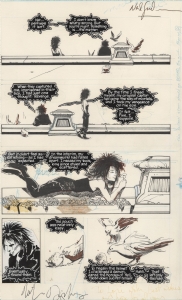
Watson & Holmes 2 page 6 by Rick Leonardi
Artist: Rick Leonardi (Penciller)
9 Comments - 378 Views - 5 Likes

Additional Images:

Published page
Artwork Details
|
DescriptionA fun little page from an independent series for which Rick Leonardi drew the first 4 issues : Watson & Holmes.What if the popular literature characters were two Afro-Americans? It went beyond what could be perceived as a simple gimmick and was an actual good read, a must buy in my case for the Leonardi art, shot directly from his pencils. And while I�ll admit that Leonardi�s art is much looser nowadays than it used to be, especially when it was tightly refined by Austin or Green, it is still perfectly suited to the shot from pencil exercise, proof if need be that it can work for artists who are not cramming the pages with as many details as humanly possible. What attracted me to the page is that it shows a great example of what Leonardi does best; drawing urban environments and especially urban rooftops. He did it so well in C&D and Spidey 2099 but it�s a treat to have him draw regular human characters in the same context. And of course, as the fantastic storyteller that he is, we can count on various angles, shots and body language throughout the page. In panel one, the rooftops chase begins with a great establishing shot. I love the bad guy�s position in panel two as he is firing backwards without taking the time to look back at his targets. That�s dynamic and realistic positioning here. Plus you could think that his non firing hand is too loosely drawn while it�s in fact commensurate with the lightning coming from the gun. A great close up on our two heroes in the 4rth (without what could have been hindering backgrounds) and a great last panel which continues the chase and calls for the reader to turn to the next page to see how it goes. I love the close up on the shoes and how the two heroes are struggling to keep an eye on their target while coming down the fire escape. For me the page borders on sophisticated story boarding in the sense that it�s not super tight but all the essential elements are present, readily identifiable and easy to read (without needing any words). This is fluid storytelling at its best by a true master of the exercise. Social/Sharing |
About the Owner
|
Contact the OwnerUse can use a contact form to send an email to this gallery owner,
|
Comments on this Artwork
You must be logged in to make comments.
B. P.
Member Since 2011
1 - Posted on 10/11/2021
A real beauty! Congrats! I've been wondering about these pages and where to pick them up.
Marcus Wai ![]()
Member Since 2005
1 - Posted on 10/11/2021
It would take a bit more deduction to figure this was Leonardo's modern style as it shows evolution and confidence. Great show. Great show homey.
J H ![]()
Member Since 2019
1 - Posted on 10/11/2021
I like those pencils a lot more than the finished product. It lost some oomph from his visual storytelling, imo. The pencils are tight, but loose with action, and sparser for some backgrounds to bring the characters and action into focus. like this one, too, it's a neat rooftop fight page. Congrats!
Ruben DaCollector ![]()
Member Since 2008
1 - Posted on 10/11/2021
The storytelling is as excellent as it always is with Leonardi, there's no doubt about that. But I'm with JH, in an effort for whoever the publisher was to publish the story and minimize costs in doing so, they made the decision to not hire an inker and to color straight from the pencils, no doubt using a terrible colorist willing to work at a cheap page rate. Because the finished product is absolutely hideous. The colors are pure amateur hour, and using darkening the line art with software always intensifies some lines much more than others, making a mess of it all.
But regardless, the nice thing about original art is that we can enjoy the pure art for its own sake and don't have to stare at the digitally "enhanced" version if we don't want to. Having said that, I'm glad you were still able to get good writing out of it!
F M ![]()
Member Since 2005
1 - Posted on 10/11/2021
Ruben DaCollector wrote:
The storytelling is as excellent as it always is with Leonardi, there's no doubt about that. But I'm with JH, in an effort for whoever the publisher was to publish the story and minimize costs in doing so, they made the decision to not hire an inker and to color straight from the pencils, no doubt using a terrible colorist willing to work at a cheap page rate. Because the finished product is absolutely hideous. The colors are pure amateur hour, and using darkening the line art with software always intensifies some lines much more than others, making a mess of it all.
But regardless, the nice thing about original art is that we can enjoy the pure art for its own sake and don't have to stare at the digitally "enhanced" version if we don't want to. Having said that, I'm glad you were still able to get good writing out of it!
Agreed that publishing it from pencils was obviously a way to minimize costs, which is clearly the case considering the "quality" of the coloring. That being said, even manhandled, Leonardi's art remain a must buy and enjoyable in itself for me :)
Ruben DaCollector ![]()
Member Since 2008
2 - Posted on 10/11/2021
Yes, I understand that small time publishing can sometimes only work from a financial standpoint by cutting out the inker. That's okay, but these publishers need to figure out that it would be better if they colored directly from the pencils but found a printer and the best possible paper stock to publish the pencils WITHOUT first darkening them in Photoshop or Illustrator. It looks very unnatural and obvious that either the "levels" or "contrast" was jacked up on the pencils in an effort to darken the line art and also hope the buyers think it's been inked, rather than digitally darkened. DC Comics proved 37 years ago with the publication of Nathaniel Dusk and especially with Nathaniel Dusk II that pencils can be published "as is", with the right paper, coloring and no need to artificially darken the line art.
Jason Hussa ![]()
Member Since 2017
1 - Posted on 10/12/2021
I agree on all counts with what you wrote, F M; this is a lovely page filled with excellent storytelling elements at play. It has a bit of everything - beautiful rooftop establishing shot, solid flow, a few great shots of our heroes, and an overall excellent construction (I really like the backgrounds on this page; present where they need to be, and giving the impression of the environment, but not overwhelming the moment or bogging down the action). I love the wide pencil shading which denotes the folds of their coats, and the raked angle on the last panel is awesome - that shot only works because of it, but it doesn't feel forced at all. Looking at these pencils, I would think that the scene was a night scene, and I'm going to have to agree with you and Ruben about the quality of the final presentation, via-a-vie the coloring choices. Very cool to see the original pencils here! Great find, F M!
K Gearon ![]()
Member Since 2011
1 - Posted on 10/13/2021
I gotta look into this book! And dig your description - Leonardi one of those guys that can do no wrong. Congrats!
E DLS ![]()
Member Since 2005
1 - Posted on 10/17/2021
Obviously, none of us are privy to whatever digital process was used to produce the printed image. It almost seems as if a decision was made to place emphasis on the character figures and treat the background as, well, background. Or, at the end of the day, it could just be a really, really, bad coloring job by someone who wasn't very good or didn't know what they were doing. As is always the case, thank goodness for the original. Nice page and nice write up.
Latest Updates
All |
|
Auctions ADVERTISEMENT
 |
Auctions
| Joe Bennett Joe Bennett Savage Hawkman #17 and 19 |
Auctions
 |
MIKE DRINGENBERG SANDMAN #8 PAGE 7 (1989, 1ST DEATH) SOLD FOR $100,500! |
Auctions
 |
Jack Kirby - Journey into Mystery #86, Page 11 - The 4th appearance of Thor! |
Hakes Auctions
 |
SUPERMAN: SECRET ORIGIN #2 VARIANT COMIC BOOK COVER ORIGINAL ART BY GARY FRANK. |


Subscribe to the YouTube Channel.. FREE!
 Splash Page Comic Art
17 Accepting Commissions
Commission an Artist
For Sale Updates
Classified Updates |
|
Monty B9/5/2025 3:53:00 PM |
|
Saxa Luna Galianan9/5/2025 1:01:00 PM |
|
Will Gabri-El9/5/2025 12:25:00 PM |
|
Michele M9/5/2025 12:05:00 PM |
|
Keith Veronese9/5/2025 11:09:00 AM |
|
Aron Wiesenfeld9/5/2025 10:39:00 AM |
|
Dealer Updates |
|
Coollines Artwork9/5/2025 9:24:00 PM |
|
Koch Comic Art9/5/2025 7:54:00 PM |
|
Anthony's Comicbook Art9/5/2025 6:43:00 PM |
|
Will's Comic Art Page9/5/2025 12:25:00 PM |
|
Essential Sequential9/5/2025 12:15:00 PM |
|
Achetez de l'Art9/5/2025 12:15:00 PM |
|
|
Become a Premium CAF Gallery Owner & you'll be supporting CAF and also gain access to many services and features not available to standard members.
|