


Daan Jippes & Carl Barks: Storm Dancers 4th page
Artists: Daan Jippes (Penciller) , Daan Jippes (Inker) , Carl Barks (Layouts) , Carl Barks (Writer)
2 Comments - 1,074 Views - 0 Like

Additional Images:

Temporary Title

Temporary Title

Temporary Title
Artwork Details
|
DescriptionI simply love Daan Jippes' artwork!Here's the 4th page from Carl Barks script Woodchuck story "Storm Dancers". In Jippes' artwork there is always his blue pencil draft in background and ink on top of it. If you'll buy Barks' or Rosa's published comic book artwork, you will always get plain inked artwork. Blue color pencil is disappearing when taking photos for printing, so it is not harming, but rather creating nice depth into original artwork. The only way to see them is to buy Jippes' artwork. There's an excellent article about this page by Mark Kennedy, having also Jippes' comment at the end. Please check this: http://sevencamels.blogspot.cz/2008/10/daan-jippes-and-carl-barks.html Daan Jippes and Carl Barks I've been a fan of Daan Jippes as long as I can remember. I was very excited when I found out that Gemstone as publishing a new treasury that included many of the Donald Duck stories Daan has illustrated. However one of the most interesting things about the treasury was this page below. It explains that Carl Barks drew 24 rough stories that he was unable to clean up and finish. So other artists were hired in the 1970s to do final artwork for the stories so that they could be published. Now the first thing to note is that I feel really badly for the artists who were hired to redraw these and who are referred to as having done a rather poor job with the original Barks scripts, especially Kay Wright who is mentioned here by name. I'm sure they did their best to take on what would be a pretty daunting task. But it's true what the author here implies...the page represented here from Wright's version seems pretty bland. Anyway the reason this page is so fascinating is that we can compare Bark's original rough with two different versions of the final page and see how it was interpreted by different artists: Daan Jippes and Kay Wright. That's such a rare treat - if anyone knows where there might be more of these Barks roughs online let me know. Overall, Daan has worked a lot harder to get depth into his panels than Wright did. Just look at the first panel where Wright's wall is parrallel to the picture plane while Daan's version of the wall recedes in perspective to give more interest but it also gives the panel a better composition. The wall leads your eye back into the center of the composition and over to the left while the mountain on the left of the panel helps keep your eye from drifting off the left side of the page. Notice how Wright's version of the tree in that first panel is placed almost in the middle of the page, which always makes for a static composition. Also Wright's version is a very generic tree - with a very simply drawn version of leaves that is visually uninteresting. Also the way the word balloons separate the trunk from the leaves makes the trunk and the leaves seem separate from each other. That tree doesn't add anything to the composition. In Daan's panel, on the other hand, there is great care taken to compose the dialogue panels so that the transition from trunk to leaves is clearly seen. The tree is placed off to the side instead of right in the center of the panel. Also Jippes uses the leaf shapes to keep your eye pointed down towards the characters, the most important part of the panel. Also in the first panel notice the placement of the characters. Jippes stayed pretty close to what Barks drew and he arranged the composition and perspective so that what Barks had made sense. Daan drew background elements like the hill in the foreground to accommodate the figures the way Barks had drawn them. Wright flattened everything out, making the ground plane flat and the fence flat as well, and then arranged figures on top of that so that the composition would feel "filled out", but the figures don't feel like they're really sitting in that space. The figure on the left is standing right on the bottom line of the panel (always an awkward choice) and the top of the head on the right looks funny because the ground plane is so flat. That character's head - if he were standing - should be blocking our view, otherwise the ground is staring to slope suddenly under that one guy. It would have worked better if Kay had drawn that head bigger but because it's the same size as the one just to the left of it (the pig head) it looks like the figure is standing on the same plane as the pig in space and that the figure is either really really short or standing in a hole. ... #DaanJippes Social/Sharing |
About the Owner
|
Contact the OwnerUse can use a contact form to send an email to this gallery owner,
|
Comments on this Artwork
You must be logged in to make comments.
S�ren M ![]()
Member Since 2008
Posted on 2/13/2018
Wonderful artwork. Jippes did a great job here. Congrats, Matti. ;-)

Latest Updates
All |
|
Auctions ADVERTISEMENT
 |
Auctions
| Jimmy (Jim) Janes and Rudy Nebres The Rook Magazin |
Auctions
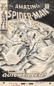 |
JOHN ROMITA AMAZING SPIDER-MAN #71 COVER (SOLD FOR $220K!) |
Auctions
 |
Mike Sekowsky - Justice League of America #21, Page 17 - Crisis on Earth-One! |
Hakes Auctions
 |
STAR WARS WEEKLY #8 COMIC BOOK COVER ORIGINAL ART BY GIL KANE. |


Subscribe to the YouTube Channel.. FREE!
 Albert Moy
3 Accepting Commissions
Commission an Artist
For Sale Updates
Classified Updates |
|
Brendon and Brian Fraim9/7/2025 1:01:00 PM |
|
Nikolaos K9/7/2025 12:39:00 PM |
|
Will Gabri-El9/7/2025 10:50:00 AM |
|
Athenaeum Comic Art9/7/2025 10:24:00 AM |
|
Rick Verbanas9/7/2025 9:50:00 AM |
|
Peter Venkman9/7/2025 9:25:00 AM |
|
Dealer Updates |
|
Will's Comic Art Page9/7/2025 12:25:00 PM |
|
Val Semeiks9/7/2025 12:15:00 PM |
|
Kirby's Comic Art9/7/2025 12:15:00 PM |
|
Essential Sequential9/7/2025 12:15:00 PM |
|
Achetez de l'Art9/7/2025 12:15:00 PM |
|
Galerie Daniel Maghen9/7/2025 12:15:00 PM |
|
|
Become a Premium CAF Gallery Owner & you'll be supporting CAF and also gain access to many services and features not available to standard members.
|