|
Batman The Last Halloween Issue 1 page 18
Artist: Eduardo Risso (All)
7 Comments - 213 Views - 17 Likes
Artwork Details
|
DescriptionWhen The Last Halloween was announced earlier this year, I had mixed feelings. On one hand, I was excited for a new story in Jeph and Tim's vision of Gotham City. But on the other, I couldn't imagine The Long Halloween without Tim�s signature artwork. Dark Victory was an excellent sequel (honestly, I even preferred it to the original), but did we really need a final act? If it isn�t broken, why fix it, right?The concept of rotating artists for each issue was intriguing, though. I read that Jeph Loeb handpicked the artists himself, which added a layer of intention to the project. Eduardo Risso was chosen to lead off with issue one�a strategic decision, in my opinion. Risso�s noir style features stark, moody visuals often depicting dark story-lines. One of his most distinctive elements is his expert use of shadows and ability to manipulate negative space, which play a key role in setting the mood and atmosphere of a scene. I would like to think he was chosen first as it would give readers a sense of familiarity, setting the tone for the next 9 issues. I'm a big fan of Risso's work, so when he was announced as the first artist, I reached out to his son, Nico. This was in May, and the issue wouldn�t be released until September. Only the variant cover was available for purchase at that point, and I decided to pass on it (though I might�ve caved if it had been in black and white with the booking card filled in traditionally). I asked to be placed on the wait list for the interior pages instead. Once the issue was out, I got an email saying there was just one person ahead of me on the list and that I�d have 48 hours to decide on any available art once the scans were sent over. My friend Jared was first in line, and I worried he�d snag all the best �moment pages� since we share similar tastes. But he passed, leaving me with free rein over issue one. I rushed home that day, opened my email, and there was the entire first issue in its dark, inky glory. Although I hadn�t read it yet, the sequential storytelling was so strong I could follow the plot perfectly. After much deliberation, I chose two pages. Page 18 was my first choice. The first panel immediately grabbed my attention with its striking use of negative space to emphasize the rain. The water streaming down Gordon�s face and trench coat, the light from the Bat-Signal - Gotham's atmosphere - everything captured that deflated look on Gordon as he stands on the familiar rooftop where he, Batman, and Harvey Dent once made their pact a lifetime ago. I love the composition of the page with the rain throughout, ending with little ripples in the puddles, reminding me of the last panels in "The Killing Joke". Sometimes different is good. While it felt different without Tim's art, I thoroughly enjoyed the first issue. I do wonder if the story will feel cohesive with 10 distinct artists and their varied styles. But given how important this title is to Jeph, I trust he put a lot of thought into these choices. And I suspect the context around The Last Halloween will inspire each artist to bring their A-game as a tribute to their peer. Social/Sharing |
About the Owner
|
Contact the OwnerUse can use a contact form to send an email to this gallery owner,
|
Comments on this Artwork
You must be logged in to make comments.
Michael 07
Member Since 2011
1 - Posted on 10/27/2024
The page I ve missed!!! No wayyyyy! Congrats to you, happy to see it in a perfect collection ;)
Steve . M ![]()
Member Since 2017
1 - Posted on 10/27/2024
Best page from the first issue! Congratulations!!!
Sonu Kumar ![]()
Member Since 2018
Posted on 10/29/2024
Steve . M wrote:
Best page from the first issue! Congratulations!!!
Mine too! The first one to catch my eye. There was a few in there that I was tempted to get
Marcus Wai ![]()
Member Since 2005
1 - Posted on 10/28/2024
High quality Risso! His vision is closest to what Tim Sale had achieved. The stark contrasts and the sparse details forcing focus does justice to the storyline.
Scott Spilky ![]()
Member Since 2013
1 - Posted on 11/9/2024
Greatness from Risso that harkens back to Sale's best Batman work.
Jared Michalski
Member Since 2004
1 - Posted on 11/30/2024
While Tim and Eduardo share a strong sense of positive and negative space, their styles are very different. That said, that top panel of Gordon gives me Tim vibes while still being distinctly Risso. Splendid page for a collector with splendid taste in art... although your taste in friends may be questionable...
Sonu Kumar ![]()
Member Since 2018
1 - Posted on 12/2/2024
Jared Michalski wrote:
While Tim and Eduardo share a strong sense of positive and negative space, their styles are very different. That said,�that top panel of Gordon gives me Tim vibes while still being distinctly Risso. Splendid page for a collector with splendid taste in art... although your taste in friends may be questionable...
HA! I blame you for all the Risso's in my collection

Latest Updates
All |
|
Auctions ADVERTISEMENT
 |
Auctions
| Michael Kaluta The Abyss #1 Double Page Spread 14- |
Auctions
 |
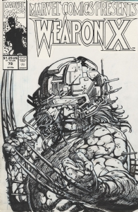
BARRY WINDSOR-SMITH MARVEL COMICS PRESENTS #79 COVER (SOLD FOR $320K) |
Auctions
 |
Dave Cockrum - X-Men #150 Cover |
Hakes Auctions
 |
SUPERMAN: SECRET ORIGIN #2 VARIANT COMIC BOOK COVER ORIGINAL ART BY GARY FRANK. |


Subscribe to the YouTube Channel.. FREE!
3 Accepting Commissions
Commission an Artist
For Sale Updates
Classified Updates |
|
* HoxtonArcade9/7/2025 6:48:00 AM |
|
Rene Dorenbos9/7/2025 5:28:00 AM |
|
David H9/6/2025 9:51:00 PM |
|
Rugrat Spawn9/6/2025 5:47:00 PM |
|
Chris Dietzel9/6/2025 3:38:00 PM |
|
Peter Venkman9/6/2025 2:54:00 PM |
|
Dealer Updates |
|
RomitaMan Original Art9/7/2025 2:23:00 AM |
|
NSN Art9/7/2025 12:01:00 AM |
|
TDArt Gallery9/6/2025 7:54:00 PM |
|
Anthony's Comicbook Art9/6/2025 3:57:00 PM |
|
Coollines Artwork9/6/2025 3:28:00 PM |
|
Will's Comic Art Page9/6/2025 12:52:00 PM |
|
|
|


