


|
Batman The Last Halloween Issue 1 page 15
Artist: Eduardo Risso (All)
4 Comments - 219 Views - 15 Likes

Artwork Details
|
DescriptionWhen The Last Halloween was announced earlier this year, I had mixed feelings. On one hand, I was excited for a new story in Jeph and Tim's vision of Gotham City. But on the other, I couldn't imagine The Long Halloween without Tim�s signature artwork. Dark Victory was an excellent sequel (honestly, I even preferred it to the original), but did we really need a final act? If it isn�t broken, why fix it, right?The concept of rotating artists for each issue was intriguing, though. I read that Jeph Loeb handpicked the artists himself, which added a layer of intention to the project. Eduardo Risso was chosen to lead off with issue one�a strategic decision, in my opinion. Risso�s noir style features stark, moody visuals often depicting dark story lines. One of his most distinctive elements is his expert use of shadows and ability to manipulate negative space, which play a key role in setting the mood and atmosphere of a scene. I would like to think he was chosen first as it would give readers a sense of familiarity, setting the tone for the next 9 issues. I'm a big fan of Risso's work, so when he was announced as the first artist, I reached out to his son, Nico. This was in May, and the issue wouldn�t be released until September. Only the variant cover was available for purchase at that point, and I decided to pass on it (though I might�ve caved if it had been in black and white with the booking card filled in traditionally). I asked to be placed on the wait-list for the interior pages instead. Once the issue was out, I got an email saying there was just one person ahead of me on the list and that I�d have 48 hours to decide on any available art once the scans were sent over. My friend Jared was first in line, and I worried he�d snag all the best �moment pages� since we share similar tastes. But he passed, leaving me with free rein over issue one. I rushed home that day, opened my email, and there was the entire first issue in its dark, inky glory. Although I hadn�t read it yet, the sequential storytelling was so strong I could follow the plot perfectly. After much deliberation, I chose two pages. Page 15 was the second page I picked up. I mean, whats the Last Halloween without a pumpkin and the infamous Holiday .22 pistol? This page is a compelling example of quintissential Risso. He employs high contrast and shadow which helps create a dramatic and tense mood. The shadows add depth, making the eye focus on what he wants you to focus on. Batman and robin have intense expressions which reflect the seriousness of the situation. The page layout guides the reader's eye naturally through the scene. We get a powerful top panel that frames the page, followed by a series of smaller panels that zoom in on the characters and provide a more intimate view of their emotions. The negative space in the fourth panel almost forces the eye to Batman's worried expression. The sequential story telling here draws the reader into the narrative. The rain dripping over the characters and splashing on the surfaces help set the gloom and grit that is Gotham City. Risso's style is a fitting choice in any Batman story. Sometimes different is good. While it felt different without Tim's art, I thoroughly enjoyed the first issue. I do wonder if the story will feel cohesive with 10 distinct artists and their varied styles. But given how important this title is to Jeph, I trust he put a lot of thought into these choices. And I suspect the context around The Last Halloween will inspire each artist to bring their A-game as a tribute to their peer. Social/Sharing |
About the Owner
|
Contact the OwnerUse can use a contact form to send an email to this gallery owner,
|
Comments on this Artwork
You must be logged in to make comments.
Steve . M ![]()
Member Since 2017
1 - Posted on 10/27/2024
When I think of Long Halloween, or Dark Victory (I agree DV is even better than LH) or a Tim Sale, to I think of you and Jared.
All-too fitting you snagged the first pages from this first issue. I hope the final story has the longevity of the first two chapters.
Congratulations!!
Sonu Kumar ![]()
Member Since 2018
Posted on 10/29/2024
Steve . M wrote:
When I think of Long Halloween, or Dark Victory (I agree DV is even better than LH) or a Tim Sale, to I think of you and Jared.�
�
All-too fitting you snagged the first pages from this first issue. I hope the final story has the longevity of the first two chapters.
�
Congratulations!!
Thank you! Excited for issue 2 tommorrow.
Jared Michalski
Member Since 2004
1 - Posted on 11/30/2024
A strong write up to go along with a strong page, Sonu. Excellent choice to go with a page featuring the famous .22 pistol, and the storytelling is as spectacular as you point out. I also really like Eduardo's Robin. His youth shines and Risso's choice to avoid heavy inking on him allows him to stand out from his brooding partner.
Latest Updates
All |
|
Auctions ADVERTISEMENT
Auctions
| Al McWilliams Dateline: Danger! Comic Strip Origin |
Auctions
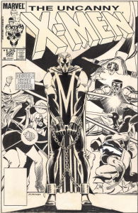 |
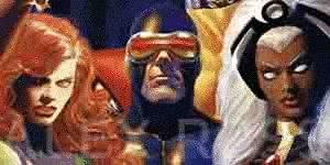
JOHN ROMITA JR. UNCANNY X-MEN #200 COVER (1985, "THE TRIAL OF MAGNETO!" ICONIC IMAGE OF THE 'NEW LOOK' MAGNETO IN CHAINS AND THE X-MEN IN BATTLE ON THIS MILESTONE COVER) |
Auctions
 |
Jim Starlin - Epic Illustrated #14 - 'Messiah' Complete 6 Page Story |
Hakes Auctions
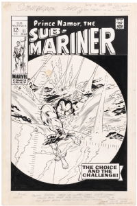 |
SUB-MARINER #11 COMIC BOOK COVER ORIGINAL ART BY GENE COLAN. |


Subscribe to the YouTube Channel.. FREE!
 TDArt Gallery
12 Accepting Commissions
Commission an Artist
For Sale Updates
Classified Updates |
|
Monty B9/5/2025 3:53:00 PM |
|
Saxa Luna Galianan9/5/2025 1:01:00 PM |
|
Will Gabri-El9/5/2025 12:25:00 PM |
|
Michele M9/5/2025 12:05:00 PM |
|
Tim J9/5/2025 12:04:00 PM |
|
Keith Veronese9/5/2025 11:09:00 AM |
|
Dealer Updates |
|
Coollines Artwork9/5/2025 8:41:00 PM |
|
Koch Comic Art9/5/2025 7:54:00 PM |
|
Anthony's Comicbook Art9/5/2025 6:43:00 PM |
|
Will's Comic Art Page9/5/2025 12:25:00 PM |
|
Essential Sequential9/5/2025 12:15:00 PM |
|
Achetez de l'Art9/5/2025 12:15:00 PM |
|
|
Become a Premium CAF Gallery Owner & you'll be supporting CAF and also gain access to many services and features not available to standard members.
|