


Artwork Details
|
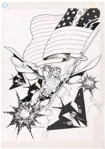
DescriptionConsidering adding printed paste-up to recreate the original cover. Would be done by a professional conservator, of course, but not convinced this is a good idea. Feedback welcomed.Social/Sharing |
About the Owner
|
Contact the OwnerUse can use a contact form to send an email to this gallery owner,
|
Comments on this Artwork
You must be logged in to make comments.
Marcus Wai ![]()
Member Since 2005
1 - Posted on 8/19/2021
This is how it left Clowes' drawing board and he deemed it perfect at that time.
If you were going to sell, by all means. Even to a buyer, are they nostalgic for the Comics Journal? Or do they love his work as an artist regardless?
FBS Stroun ![]()
Member Since 2021
1 - Posted on 8/23/2021
Marcus Wai wrote:
This is how it�left Clowes' drawing board and he deemed it perfect at that time.�
If you were going to sell, by all means.� Even to a buyer, are they nostalgic for the Comics Journal?� Or do�they�love his work as an artist regardless?
Whille the "nostalgia" factor re buying this issue of TCJ, important, not as important as Dan Clowes being an amazing graphic designer, and him leaving an "enpty space" in his composition for the magazine's title. Will probably "complete" the composition at some point in the future. Just got the piece framed, not ready to tinker with it quite yet. Thank you for your most thoughtfull feedback.
paul bogdanowski
Member Since 2006
Posted on 8/19/2021
Wow, wonderful inking by that wonderful artist. Congratulations. Love that cover!
Mark V ![]()
Member Since 2021
Posted on 8/19/2021
I don't think it needs the trade dress unless you have a lot of nostalgia for picking up that issue of the Comics Journal. Clowes' piece definitely stands on its own.
Dan P ![]()
Member Since 2009
Posted on 8/19/2021
A wonderful self portrait from my favorite period of his work. I adore it.
There is no right or wrong answer regarding stats. Totally a personal preference, assuming you use a pro. If you PM me, I can give you three good references.
Geoff Art ![]()
Member Since 2014
1 - Posted on 8/24/2021
It's a great piece as it is, but personally I'd complete the composition with some carefully constructed paste ups rather than leave the gaps.
Antonio Aguirre
Member Since 2008
1 - Posted on 8/26/2021
You may also want to consider having a graphic designer recreate the title/caption text and getting it printed on a transparent overlay--that's how some of the text was applied to Clowes' stories in the early issues of Blab! That way you wouldn't really be affecting the art.
Congrats--cool piece!
Peter Sullivan ![]()
Member Since 2006
1 - Posted on 5/8/2022
I have to agree with Marcus. The Comics Journal logo was pretty ugly.

Latest Updates
All |
|
Auctions ADVERTISEMENT
 |
Original Comic Art / Robotech II the Sentinels Book 2 #21 page 9 |
Auctions
| Ham Fisher Joe Palooka Daily Comic Strip Original |
Auctions
 |
FRANK FRAZETTA DEATH DEALER IV OIL PAINTING |
Auctions
 |
Jim Starlin - Warlock #13, Page 7 |
Hakes Auctions
 |
SUPERMAN: THE MAN OF STEEL SOURCEBOOK RPG BOOK COVER ORIGINAL ART BY DAN JURGENS. |


Subscribe to the YouTube Channel.. FREE!
 3 Wishes
21 Accepting Commissions
Commission an Artist

For Sale Updates
Classified Updates |
|
Rugrat Spawn9/6/2025 5:47:00 PM |
|
Chris Dietzel9/6/2025 3:38:00 PM |
|
Peter Venkman9/6/2025 2:54:00 PM |
|
Will Gabri-El9/6/2025 12:52:00 PM |
|
COMIX ART9/6/2025 11:30:00 AM |
|
Federico Bettini9/6/2025 11:20:00 AM |
|
Dealer Updates |
|
TDArt Gallery9/6/2025 7:54:00 PM |
|
Anthony's Comicbook Art9/6/2025 3:57:00 PM |
|
Coollines Artwork9/6/2025 3:28:00 PM |
|
Will's Comic Art Page9/6/2025 12:52:00 PM |
|
Essential Sequential9/6/2025 12:15:00 PM |
|
Kinetic Collectibles9/6/2025 12:15:00 PM |
|
|
Become a Premium CAF Gallery Owner & you'll be supporting CAF and also gain access to many services and features not available to standard members.
|