Additional Images:
Artwork Details
|
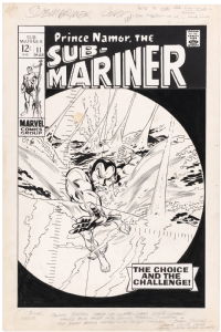
DescriptionMy OA Collecting has always been skewed towards the intersection between Comic Art & Animation. Despite the limited-animation featured in these original Marvel Super Heroes cartoons,-- the characters and BGs all feature the kind of authentic chiaroscuro that replicated what I saw, in the comic-books I read and collected!The cartoons were produced in 1966 by the Grantray-Lawrence Animation studios. The artwork was all done in Hollywood. It was one of the earliest cartoon series to make use of the new "Xerography" process.. The black & white art was transferred onto Cels and painted. Disney made use of the same process for it's animated feature: "One Hundred and One Dalmatians", a few years earlier, in 1961.. However, all of the voice acting was recorded in Toronto, Canada.. Using many of the same actors that began their careers in Radio/TV Broadcasting for the CBC. Famous Canadian actor John Vernon voiced "Prince Namor".. In 1966, Vernon was also appearing in his own popular CBC TV series: "Wojeck"; playing a coroner/detective, solving crimes and seeking justice! These inked Animation Layouts were all done by Mel Keefer.. A great inker who got his start working in the comic-book field, before becoming a Layout artist at Grantray-Lawrence. Many of the originals have interesting Camera Notes on them. And on some, appendages and/or secondary characters are missing.. because they were animated separately, on another Cel level.. Social/Sharing |
About the Owner
|
Contact the OwnerUse can use a contact form to send an email to this gallery owner,
|
Comments on this Artwork
You must be logged in to make comments.
Marcus Wai ![]()
Member Since 2005
1 - Posted on 7/30/2022
A really nice animation drawng that looks more comic detailed than most cartoons of the time. It made the animation play out more dramatic and less fluid and less colorful as it was the style of these Marvel cartoons.
Rich Dannys ![]()
Member Since 2006
1 - Posted on 7/30/2022
Marcus Wai wrote:
A really nice animation drawng that looks more comic detailed than most cartoons of the time.� It made the animation play out more dramatic and less fluid and less colorful as it was the style of these Marvel cartoons.�
The fact that this 1966 stuff looks so much like the comic-books, is what I find so appealing! Sure, it didn't move quite as good.. But for me too, they're much more authentic interpretations of the Marvel books. It's strange to me, that they removed all of that lovely inked feathering in the Layout, in the finished cartoon?..
Marcus Wai ![]()
Member Since 2005
1 - Posted on 7/30/2022
Rich Dannys wrote:
The fact that this 1966 stuff looks so much like the comic-books, is what I find so appealing! Sure, it didn't move quite as good.. But for me too, they're much more authentic interpretations of the Marvel books. It's strange to me, that they removed all of that lovely inked feathering in the Layout, in the finished cartoon?..
It may have been the limits of what they could have done to have the level of detail remain consistent.

Latest Updates
All |
|
Auctions ADVERTISEMENT
 |
Auctions
| Jimmy (Jim) Janes and Rudy Nebres The Rook Magazin |
Auctions
 |
FRANK FRAZETTA DEATH DEALER IV OIL PAINTING |
Auctions
 |
Jim Starlin - Warlock #13, Page 7 |
Hakes Auctions
 |
SUB-MARINER #11 COMIC BOOK COVER ORIGINAL ART BY GENE COLAN. |


Subscribe to the YouTube Channel.. FREE!
1 Accepting Commissions
Commission an Artist
For Sale Updates
Classified Updates |
|
Rene Dorenbos9/6/2025 5:20:00 AM |
|
Monty B9/5/2025 3:53:00 PM |
|
Saxa Luna Galianan9/5/2025 1:01:00 PM |
|
Will Gabri-El9/5/2025 12:25:00 PM |
|
Michele M9/5/2025 12:05:00 PM |
|
Keith Veronese9/5/2025 11:09:00 AM |
|
Dealer Updates |
|
Coollines Artwork9/5/2025 9:24:00 PM |
|
Koch Comic Art9/5/2025 7:54:00 PM |
|
Anthony's Comicbook Art9/5/2025 6:43:00 PM |
|
Will's Comic Art Page9/5/2025 12:25:00 PM |
|
Essential Sequential9/5/2025 12:15:00 PM |
|
Achetez de l'Art9/5/2025 12:15:00 PM |
|
|
|


