Superman Transformation by Jesse Lonergan
Artist: Jesse Lonergan (All)
7 Comments - 194 Views - 14 Likes
Artwork Details
|
DescriptionWhen I commission Jesse, I never know what to expect. However, I do know it will ALWAYS be something unique.Even though I�ve commissioned him a few times already, my mind regularly conjures up new ideas I�d like to see Jesse bring to life. This time around, something about the iconic image of Clark running into a phone booth struck this Superman fan as an ideal candidate for his limitless imagination and unique sensibilities. It�s a moment that�s been captured countless times on film and the page, but never by someone with Jesse�s inventiveness. When we first chatted about the concept, in my head I pictured something with a ton of panels. After all, multi-panel grids are a well-known hallmark of Jesse�s work. But I should know by now to expect the unexpected with Jesse. To say I was surprised when he handed me a three-panel page would not be underselling the moment. However, it only took a glance to see what a smart choice that was. Splitting the image into three equal boxes literally allows the phone booth to take center stage, while his decision to frame it at the bottom of the panel allows the composition to be read both top to bottom and bottom to top. That ability to play with time is another hallmark of Jesse�s work, so I asked him about that aspect of his layouts at this year�s Baltimore Comicon. Here�s what he had to say: �I feel other people think about time in a very chronological, linear sense. But, when you think about it, a comic page is not like that. It�s not sequential. It's juxtapositional. Since I don't feel bound to be linear or chronological, it seems like I'm playing with time because I�m not really following the rules of time.� I�ll admit, I�m definitely a linear thinker. But I think that�s why Jesse�s work stands out and appeals to me so much. He sees the world in a way I don�t and brings drawings to life in a way that challenges me to see things differently. I�m grateful for his sense of time in this commission. With our natural tendency to read left to right and top to bottom, you instinctually take in the monster first, follow him to Superman and then down the action line to his costume transformation. So, you initially read it in reverse order. Yet it never feels wrong or out of place. It actually encourages a deeper involvement in the image in my opinion, as the perspective and meandering curves of the action line invite you to slow down and take in every inch of the moment. I also appreciate the juxtapositions Jesse creates here. The straight lines of the buildings and phone booth provide a wonderful contrast to the curves of the clouds and the monster terrorizing Metropolis. Meanwhile his use of screentones and textures help the white areas pop out for the viewer. Clearly, Jesse�s work is on another level to me and I hope you all enjoy this one as much as I do. Social/Sharing |
About the Owner
|
Contact the OwnerUse can use a contact form to send an email to this gallery owner,
|
Comments on this Artwork
You must be logged in to make comments.
Colin Solan ![]()
Member Since 2004
CAF Administrator
3 - Posted on 11/30/2024
When you showed this to your kids did you need to explain what a phone booth is?
Brian Mulcahy ![]()
Member Since 2004
1 - Posted on 11/30/2024
A brand new take on the three-panel page format so loved by a certain someone.
Marcus Wai ![]()
Member Since 2005
1 - Posted on 12/1/2024
The design work is all there from Lonergan! It's what sets him apart from his contemporaries!
Sonu Kumar ![]()
Member Since 2018
1 - Posted on 12/2/2024
The classic Superman trope; Clark Kent transforming into the Man of Steel to face an overwhelming threat. I was unfamiliar with Jesse's work..but now I'm paying attention. At first glance, perspective and page layout are the big winners. Three vertical panels draw my eyes upward to the impending threat looming above. The vertical splits and angle of the panels help convey how tall the buildings are and how monstrous the threat is. The bystanders and even Superman himself have varying degrees of shock and awe. Lets not forget to mention the beautiful line work. Great interpretation of a timeless narrative.
K Gearon ![]()
Member Since 2011
1 - Posted on 12/27/2024
Love the design, with that perspective and subsequent depth, as well as those 3 long vertical gutter/panel borders giving a sense of stretching, too. Congrats!
Ken Martin ![]()
Member Since 2005
1 - Posted on 1/1/2025
I just realized I never left a comment on this beauty. Done. Now I need to get in gear and set up a commission with Jesse for the Heroes or Baltimore.

Latest Updates
All |
|
Auctions ADVERTISEMENT
 |
Auctions
| Greg LaRocque and Jos� Marz�n Jr. Flash #41 Story |
Auctions
 |
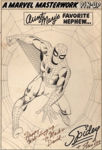
STEVE DITKO AMAZING SPIDER-MAN MARVEL MASTERWORK PIN-UP ORIGINAL ART (SOLD FOR $590K) |
Auctions
 |
Humberto Ramos - Spider-Man #4 Variant Cover |
Hakes Auctions
 |
STAR WARS #4 COMIC BOOK PAGE ORIGINAL ART BY HOWARD CHAYKIN. |


Subscribe to the YouTube Channel.. FREE!
2 Accepting Commissions
Commission an Artist
For Sale Updates
Classified Updates |
|
Monty B9/5/2025 3:53:00 PM |
|
Saxa Luna Galianan9/5/2025 1:01:00 PM |
|
Will Gabri-El9/5/2025 12:25:00 PM |
|
Michele M9/5/2025 12:05:00 PM |
|
Keith Veronese9/5/2025 11:09:00 AM |
|
Aron Wiesenfeld9/5/2025 10:39:00 AM |
|
Dealer Updates |
|
Coollines Artwork9/5/2025 9:24:00 PM |
|
Koch Comic Art9/5/2025 7:54:00 PM |
|
Anthony's Comicbook Art9/5/2025 6:43:00 PM |
|
Will's Comic Art Page9/5/2025 12:25:00 PM |
|
Essential Sequential9/5/2025 12:15:00 PM |
|
Achetez de l'Art9/5/2025 12:15:00 PM |
|
|
|


