


Green Lantern (Vol.2) #126 Page 2
Artists: Joe Staton (Penciller) , Frank McLaughlin (Inker) , Milt Snapinn (Letterer) , Dennis O'Neil (Writer)
7 Comments - 365 Views - 12 Likes
 #126 Page 2 Comic Art")
Additional Images:

Cover

Published Page
Artwork Details
|
DescriptionWhen I was eight or nine, Green Lantern was my character. He's stayed that way for a good long while. It was the book that got me into deep comic collecting, such that I spent the following twenty years (on and off), collecting the entire silver/bronze age series. I still have that Green Lantern run today. It sits in a spinner rack in a place of prominence in my home.So, yes, this was primarily a nostalgia-based acquisition, but not purely. Joe Staton was not the first artist�s name I knew and could identify by style, that was Mike Grell, but he was certainly an important piece of forming my taste in art. I associate him with Green Lantern, both character and title, and his initial run on the book was the height of my monthly reading as a "youngster." His is a classic panel-to-panel, pre-widescreen, high-density storytelling, much like other stalwarts of this era of DC. At the time, I became conscious of the concept of "house style," and I liked DC's as exemplified by the likes of Dick Giordano and Jose Luis Garcia-Lopez, but I also liked how Staton would push through the edges of that style and make it really Joe. He would lean further into his own instincts as time went on, particularly when he returned to the book after Dave Gibbons run, but I like the more subdued version as found in this early part of his first stint on Green Lantern. This page, to me, is a prime example of Staton's subdued approach as well as being right in my nostalgic sweet spot. The opportunity to snag this page could not be ignored. It�s optimal to me in many ways. Classic Staton lines, Hal in uniform in every panel, and using the power ring to make a construct all contribute to make this a very attractive page. Denny O�Neil�s words also contribute (though not his best work), as do little things like the Jack C. Harris editor�s note and blue pencil, and the combo universe-building/movie marketing of the t-shirt on the kid (spoiler: he�s not a kid). Frank McLaughlin�s bold foreground and toned background inks give Staton�s work a vibrancy that really works for this page in black and white. The foreground characters really pop against the background of From the era of cutting boards off the drums in haphazard fashion but, importantly, retains the title, number, month and publication codes on the header. Signed by Staton in the last panel. 10.5"x15.75" Graphite, ink and White-Out on Bristol Social/Sharing |
About the Owner
|
Contact the OwnerUse can use a contact form to send an email to this gallery owner,
|
Comments on this Artwork
You must be logged in to make comments.
Ruben DaCollector ![]()
Member Since 2008
2 - Posted on 8/14/2025
It's a very nice page from the era, with strong content quality giving you Green Lantern in 6 out of 6 panels. And although I've never been a big fan of Staton's work, I do like it more when combined with certain inkers and McLaughlin here is one of them, as he has something of a Dick Giordano approach to his work. All in all, a VERY fine page indeed!
Miki Annamanthadoo ![]()
Member Since 2003
2 - Posted on 8/14/2025
Nice pck up - really solid work by Staton and McLaughlin!
Marcus Wai ![]()
Member Since 2005
2 - Posted on 8/15/2025
Very underrated era of GL. Among the artists between Grell and Gibbons runs, Staton was a big name that greatly contributed to the lore! He was so good that they got him to work on Guy Gardner to become the definitive artist of that title. It's a very handsome Hal Jordan on this page!
* bronze-is-gold ![]()
Member Since 2007
2 - Posted on 8/15/2025
Great page! Love the McLaughlin inks over Staton.
Earl Edwards
Member Since 2024
1 - Posted on 8/16/2025
From one GL fantatic to another, I have to admit that Staton era is one of my two or three favorite GL eras.
It's amazing that after he left GL to try to make First Comics a success by serving as Art Director, he returned to GL and drew GL Corps for a while.
Great Staton GL page here, with a fine face panel, a couple of in-flight panels, and some cool dialogue along the way. I love it!

Latest Updates
All |
|
Auctions ADVERTISEMENT
 |
Original Comic Art / Robotech II the Sentinels Book 2 #21 page 1 |
Auctions
| Stan Goldberg, Art Saaf, and Henry Scarpelli Swing |
Auctions
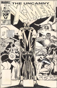 |
JOHN ROMITA JR. UNCANNY X-MEN #200 COVER (1985, "THE TRIAL OF MAGNETO!" ICONIC IMAGE OF THE 'NEW LOOK' MAGNETO IN CHAINS AND THE X-MEN IN BATTLE ON THIS MILESTONE COVER) |
Auctions
 |
John Byrne - Iron Fist #11, Page 17 |
Hakes Auctions
 |
SUPERMAN: SECRET ORIGIN #2 VARIANT COMIC BOOK COVER ORIGINAL ART BY GARY FRANK. |


Subscribe to the YouTube Channel.. FREE!
 Japan Comic Art Expo
0 Accepting Commissions
Commission an Artist
For Sale Updates
Classified Updates |
|
Rugrat Spawn9/6/2025 5:47:00 PM |
|
Chris Dietzel9/6/2025 3:38:00 PM |
|
Peter Venkman9/6/2025 2:54:00 PM |
|
Will Gabri-El9/6/2025 12:52:00 PM |
|
COMIX ART9/6/2025 11:30:00 AM |
|
Federico Bettini9/6/2025 11:20:00 AM |
|
Dealer Updates |
|
TDArt Gallery9/6/2025 7:54:00 PM |
|
Anthony's Comicbook Art9/6/2025 3:57:00 PM |
|
Coollines Artwork9/6/2025 3:28:00 PM |
|
Will's Comic Art Page9/6/2025 12:52:00 PM |
|
Essential Sequential9/6/2025 12:15:00 PM |
|
Kinetic Collectibles9/6/2025 12:15:00 PM |
|
|
Become a Premium CAF Gallery Owner & you'll be supporting CAF and also gain access to many services and features not available to standard members.
|