


|
Black Panther 1 cover by Joe Quesada & Jimmy Palmiotti
Artist: Joe Quesada (All)
23 Comments - 1,829 Views - 19 Likes

Additional Images:

TPB cover

Published cover
Artwork Details
|
DescriptionBOOM !Hum�ok, sorry about that but this has been one of my biggest purchases E-VAH so I felt it needed some kind of powerful introduction ^^ (don�t go look on Heritage for the price, it wasn�t there that I bought it ^^) This needs a bit of context. This was the Dynamic Forces exclusive variant cover to the Marvel Knight relaunch of the character in 1998. It also has been reused as the cover to the first collection of that series. I actually find it (vastly) superior to Mark Texeira�s already great cover. This series written by (then) Christopher Priest made me both a fan for life of BP, a character I already liked quite a lot for his feline, ninja-esque and full mask attributes and of Priest whose work I would follow on any project afterwards and backwards. Both the structure of the series and his writing was original and complex for the demanding fans. The series established BP as a major player in the Marvel Universe after a long fan favourite guest star status and some mid-level success/cult status series or miniseries before it. It also conveyed a true geopolitical complexity to the Marvel universe rarely reached before. For me this modern run remains unsurpassed and the best the character has ever benefited from despite other quality efforts before and since. Now about the piece. Joe Quesada is an incredible (cover) artist and he has often included strong design elements in his cover work. But on this specific cover, he really pushed the envelope on the use of negative space, both black & white to an incredible result. BP really pops against the stark white background, which in turn really pops against the sharp blacks of the NYC city roofs. It�s actually so cleverly done and balanced that at some point you get the impression it�s a black piece drawn in white while you get the exact opposite impression if look you at it at another time (or side). Simply brilliant! The design sense and use of b&w is so sharp you�d believe it was a Bryan Stelfreeze cover. The Panther�s pose is super dynamic here, you can feel he just needs to touch one obstacle with a finger or foot in order to continue his jumping run among the rooftops (like a parkour athlete would). I�m not usually a fan of the cape and cowl but here it works superbly and gives him a sense of dangerous royalty. The angle used by Joe to position him, again like a jumping ninja, drenched in shadows also adds to that dangerous side. I will underline that his body language is his own here, it�s not just any Bat-like character running on the rooftops, an easy shortcut to take when one thinks about this kind of urban settings. Lastly, I absolutely LOVE the tiny claws he drew, like those of a true panther. Another aspect to underline is that the first part of the series had a true �urban jungle� feel and vibe that is perfectly mirrored in this cover. In a sense it really previews what the series will be about. I already underlined the overall sharpness of the piece, let�s not forget to comment on the inks themselves which are rich and super sharp. Needless to say and no offence to the colorist but it works so much better in glorious b&w. I strongly believe that this particular, besides being perfect for me because of my BP love, is one of Joe�s strongest ever. I will also thank fellow collector Dave K. with whom I just had a talk about big purchases when I committed to buy this one. It played some part in my rationale to go for it and I don�t regret it. I really felt it was a now or never moment and I seized my chance. Lastly, for all those who like me LOVED that series for the great Priest writing (and some excellent art and storytelling throughout I will add), I strongly recommend reading the recently concluded Deathstroke series he penned at DC. It even includes our friend BP as a supporting character (?). It offers the same ambitious structure, geopolitical aspects and mature feel on top of nice art. The best title Priest wrote since BP. This is the 12th and last piece of my 2021 CAF birthday celebration. Hope you all liked it. Happy birthday to me :) PS: it's also a perfect companion to that fun Skottie Young cover don't you think? fun BP and dangerous BP, hand in hand. Social/Sharing |
About the Owner
|
Contact the OwnerUse can use a contact form to send an email to this gallery owner,
|
Comments on this Artwork
You must be logged in to make comments.
E DLS ![]()
Member Since 2005
1 - Posted on 2/16/2021
I love, love, love, silhouttes in the background. Kevin Nowlan does it a lot. But I'm not used to other artists doing it, or at least doing it effectively. I think it makes for such an interesting background without distracting from the main figure. I am having so much fun watching you celebrate your birthday. Hope it keeps going.
Ruben DaCollector ![]()
Member Since 2008
1 - Posted on 2/16/2021
I always love a good, high contrast page done mostly in silhouette and this is a perfect example of that. On top of getting a cool looking Black Panther cover, you also got one from a top tier artist. A great and impressive way to finish off your "12 Days of Birthday". Congratulations!
A K ![]()
Member Since 2017
1 - Posted on 2/16/2021
Wow! The Christopher Priest Black Panther series was one of those books that helped me get back into comics. I have always loved Quesada's work -- dynamic yet with non-traditonal figurework that captures the eye. Congratulations and happy birthday!
J H ![]()
Member Since 2019
1 - Posted on 2/16/2021
I love this! It's like Black Panther went to Sin City. Quesada really made something awesome here. I can see why you're over the moon, it's gorgeous. Just a fantastic rendering of BP on the prowl. (And thanks for the Deathstroke heads up, I'm going to order it now). Happy ending to your Birthday! Big, dark congrats!
Simon . K ![]()
Member Since 2020
2 - Posted on 2/16/2021
That's one hell of an iconic cover! This calls for a celebration!
Nick - Barry - Matt - Hal - Namor ![]()
Member Since 2015
1 - Posted on 2/17/2021
Beautiful! So happy to see one of our babies in a fan's hands who really loves and appreciates it!
Andy Wurst ![]()
Member Since 2004
1 - Posted on 2/17/2021
Awesome Cover. What is the story with the inking. On the one published book Jimmy Palmiotti is under Quesada's signature, on this piece it's inked but no Palmiotti signature under Quesada? Were there multiple versions?
Bill J ![]()
Member Since 2009
1 - Posted on 2/18/2021
Classic Quesada! Powerful image of the Black Panther!
K Gearon ![]()
Member Since 2011
1 - Posted on 2/19/2021
I considered making a go at this one a bit ago...but I'm glad to see it in your gallery, man! Definitely fits. This cover I always thought was so impactful with the amount of deep blacks. Striking! And I do think Quesada's one of the best to ever do it. He can do everything! And a cover I remember distinctly as the variant (when variants were rare lol) to the start of the Priest/Tex BP run. Congrats - killer way to end birthday week!
Jason Hussa ![]()
Member Since 2017
1 - Posted on 2/25/2021
Absolutely epic. Wonderful piece, and your fantastic write up covers it all. I love the shadows and balance of the whole thing, but I REALLY love how much of a statement it was in the face of what may have been an intense editorial expectation for a "pow, bang, leap!" type of first-issue cover such a release would almost mandate... Tapping Mr. Priest to write it (so the inside is like nothing ever seen before) and selecting something simmering, gorgeous, and artistic (rather than garishly explosive) for the first-issue cover. That's the Marvel Knights experiment in a nutshell right there, and boy, howdy, that 'big bang' led us to the crazy world we all inhabit today...
Gorgeous piece, Fred, and my most sincere wishes that you had a wonderful birthday (I'm late in posting this, hence the past tense). Hope you had a great one! It has certainly been 12 days of gifts for us, thanks to all of this great art you posted. :)
Magnus X
Member Since 2014
1 - Posted on 8/3/2021
I dont know what I love more. The cover or the description, Congratulations...! Its Beautiful.
Andr� . ![]()
Member Since 2015
1 - Posted on 3/11/2022
Quesada's hyper-detailed style is normally a standout for me... but it's even more impressive to see him flip that and do the same thing in mostly shadow and negative space. Great example. Congrats!
Alex B ![]()
Member Since 2008
1 - Posted on 6/22/2024
Breathtaking iconic cover ! Congrats for this incredible piece !

Latest Updates
All |
|
Auctions ADVERTISEMENT
 |
"Jim Bob and the Alien" original art mag illustration Aboriginal S |
Auctions
| Pines Artist Lucky Duck #6 "What a Night" Complete |
Auctions
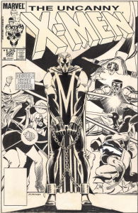 |
JOHN ROMITA JR. UNCANNY X-MEN #200 COVER (1985, "THE TRIAL OF MAGNETO!" ICONIC IMAGE OF THE 'NEW LOOK' MAGNETO IN CHAINS AND THE X-MEN IN BATTLE ON THIS MILESTONE COVER) |
Auctions
 |
Curt Swan - Superman's Girlfriend Lois Lane #105 Cover |
Hakes Auctions
 |
SECRETS OF THE LEGION OF SUPER-HEROES #3 COMIC BOOK COVER ORIGINAL ART BY DICK GIORDANO |


Subscribe to the YouTube Channel.. FREE!
 Geoff M Art Sales
2 Accepting Commissions
Commission an Artist
For Sale Updates
Classified Updates |
|
Dan Goodsell9/7/2025 5:50:00 PM |
|
M Y-C9/7/2025 4:15:00 PM |
|
Nikolaos K9/7/2025 3:59:00 PM |
|
Peter Marino9/7/2025 3:28:00 PM |
|
Arnaud B.9/7/2025 3:12:00 PM |
|
ERFAUKI D9/7/2025 2:59:00 PM |
|
Dealer Updates |
|
Will's Comic Art Page9/7/2025 12:25:00 PM |
|
Val Semeiks9/7/2025 12:15:00 PM |
|
Kirby's Comic Art9/7/2025 12:15:00 PM |
|
Essential Sequential9/7/2025 12:15:00 PM |
|
Achetez de l'Art9/7/2025 12:15:00 PM |
|
Galerie Daniel Maghen9/7/2025 12:15:00 PM |
|
|
Become a Premium CAF Gallery Owner & you'll be supporting CAF and also gain access to many services and features not available to standard members.
|