


The World of Pope - Color Version by Josť Villarrubia
Artists: Josť Villarrubia (Colorist) , Paul Pope (All)
69 Views - 10 Comments - 13 Likes

Artwork Details
|
DescriptionNot quite original art but starting off the new year with a project completed in late 2025.I love Paul Pope's art and think his work looks best in its original pen and ink form. However, I was intrigued by what color might add to the "World of Pope" commission I picked up in 2024 via Felix Comic Art. If you check out my post for the original black and white commission, you'll see that it started with the idea of Paul Pope doing a hypothetical cover to an omnibus collecting work featuring characters from his signature projects: THB, Battling Boy, Batman: Year 100, Adam Strange (Wednesday Comics, Heavy Liquid, etc. Such a cover would likely be in color so it made sense to think about what color might add to Pope's already impressive black and white composition. Once I decided to pursue a color version of the commission, only one color artist seemed appropriate: Josť Villarrubia. Villarrubia was the color artist on Batman: Year 100 and is an artist in every sense of the word. So here it is. Not quite original art but still a collaboration between two true artists. Social/Sharing |
About the Owner
|
Contact the OwnerUse can use a contact form to send an email to this gallery owner,
|
Comments on this Artwork
You must be logged in to make comments.
FBS Stroun ![]()
Member Since 2021
1 - Posted on 1/7/2026
What a smart, nice commission idea !
Villarrubia is truly a great artist. His meticulous restauration work on Richard Corben's work is outstanding, I love his illustrations for Alan Moore's Voice of Fire and his colors on Sweet Tooth are truly epochal.
Congratulation !
Comic Art Channel ![]()
Member Since 2018
1 - Posted on 1/7/2026
Beautiful!! So well executed by Pope's go-to colorist.
Ruben DaCollector ![]()
Member Since 2008
1 - Posted on 1/7/2026
I think the colors compliment the line art really well. But as an original art collector, I have to ask the question: Why wouldn't you insist on getting the line art colored by hand? Is José adamant on only coloring digitally?
Mark V ![]()
Member Since 2021
1 - Posted on 1/7/2026
Ruben DaCollector wrote:
I think the colors compliment the line art really well. But as an original art collector, I have to ask the question: Why wouldn't you insist on getting the line art colored by hand? Is José adamant on only coloring digitally?
It's not an oversight by me or an unwillingness by JV. I didn't really need it colored by hand since the original is the only real world artifact I need. The digital version will serve to produce a print at a smaller size that I can frame since the original takes up a lot of wall space.
Yo Kuri ![]()
Member Since 2019
1 - Posted on 1/7/2026
I loved this from first sight. Great choice, JV is a master of color theory. There is so much going on under the surface. Sorry for the geek out that follows.
1. The acid green sky vs THB's red shoulder puts the eye at the center of the page. These complementary (contrasting) colors are extended upward from that central focus by dividing the page in two fields of harmonious analogous colors (yellow/green and purple/red) on either side of the central lightning bolt.
2. He takes care to balance the page horizontally by putting opposing dashes of the yellow and green next to Batman and a dash of THB's red in Haggard West's scarf on the left.
3. He also repeats colors on a more vertical axis. S from Heavy Liquid is lavender on the bottom left to balance the purple sky on the top right. THB is red on the bottom right to balance the SKREE red letter on the top left.
4. JV honors the U shaped composition with matching gradients on the skies on either side of the lightning bolt. The skies darken to blue and purple (analogous) which creates a frame of soothing colors around the brightness in the center.
Given the number of characters in the piece, it could have been a mad jumble. He's so skilled that he tied it all together while making it clash where it needed to clash.
I love this. Postcards! Prints! T-shirts! Mugs! Congrats!
artless artmore ![]()
Member Since 2013
1 - Posted on 1/8/2026
Beautiful coloring job on this amazing piece!
Marcus Wai ![]()
Member Since 2005
1 - Posted on 1/8/2026
Top notch job! It blends in every property into one with the color.
Kavi H ![]()
Member Since 2018
1 - Posted on 1/8/2026
Very cool project to undertake, and the end result came out looking as publishable as the original art, no surprise considering it was done by one of Pope's best coloring partners in Villarrubia. Nice work and Thanks for sharing this, Mark!
Tyler T ![]()
Member Since 2020
1 - Posted on 1/9/2026
I love this idea, have done it with a few of my commissions, and to me personally it's worth it to do with some of your absolute favorites. It's always fun to see an original in a new light and Villarubia definitely brings this to life. Cool to see.
Bill J ![]()
Member Since 2009
1 - Posted on 1/20/2026
Villarrubia really knocked this one out of the park!
Latest Updates
All |
|

Auctions ADVERTISEMENT
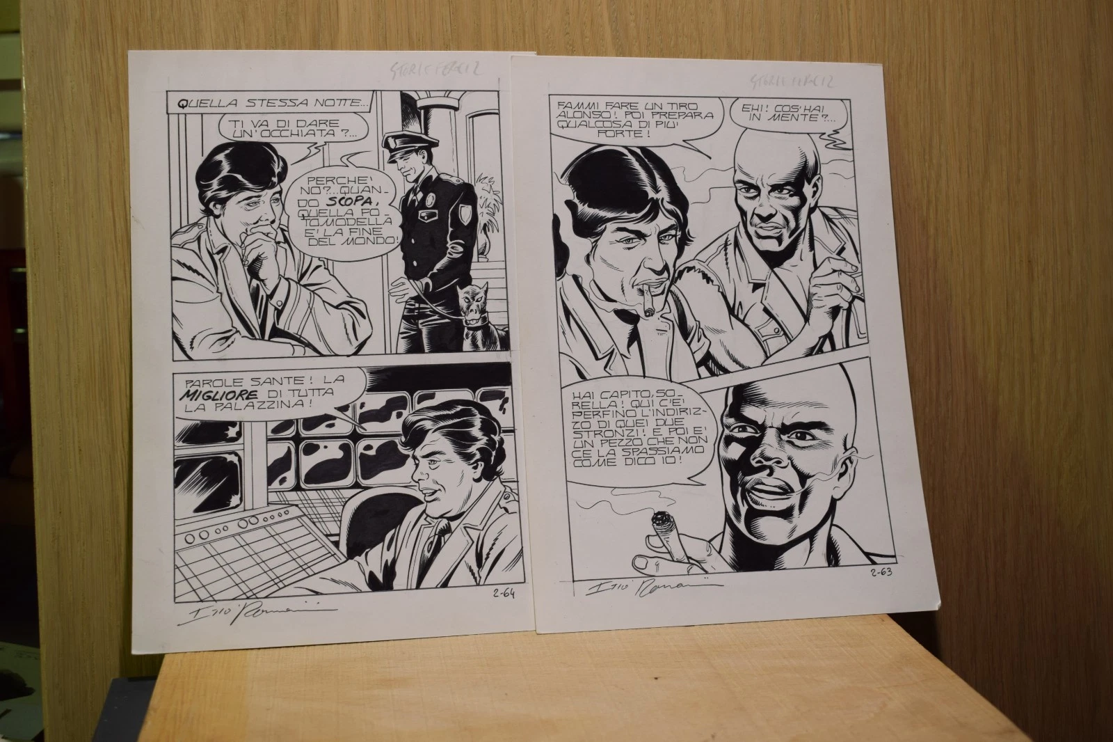 |
SIGNED!! Romanini Storie Feroci No. 2 sequence of original boards |
Auctions
| Comic Artist - Baseball Story Page 13 Original Art |
Auctions
 |
DAVE COCKRUM AND TERRY AUSTIN X-MEN #122 COVER (SOLD FOR $250K) |
Auctions
 |
Michael Kaluta - ĎThe Wedding Guest' - The Studio Painting |
Hakes Auctions
 |
BRIDE OF FRANKENSTEIN NUDE PIN-UP ORIGINAL ART COMMISSION WITH PRELIMINARY PENCIL ART BY BRUCE TIMM. |


Subscribe to the YouTube Channel.. FREE!
 Modern Mythology Comic Art
1 Accepting Commissions
Commission an Artist
For Sale Updates
Classified Updates |
|
Robert Hughes1/23/2026 7:28:00 PM |
|
Monty B1/23/2026 5:37:00 PM |
|
Mugen R.1/23/2026 4:52:00 PM |
|
ComicLINK.Com Auctions1/23/2026 4:47:00 PM |
|
NELSON H1/23/2026 3:11:00 PM |
|
ENRIQUE ALONSO1/23/2026 2:36:00 PM |
|
Dealer Updates |
|
RomitaMan Original Art1/24/2026 5:27:00 AM |
|
Coollines Artwork1/23/2026 9:53:00 PM |
|
Koch Comic Art1/23/2026 7:20:00 PM |
|
Anthony's Comicbook Art1/23/2026 4:51:00 PM |
|
ComiConArt1/23/2026 3:57:00 PM |
|
Catskill Comics1/23/2026 2:15:00 PM |
|
|
Become a Premium CAF Gallery Owner & you'll be supporting CAF and also gain access to many services and features not available to standard members.
|