


12) Vicente Cifuentes inks over Wrightson
Artists: Bernie Wrightson (Penciller) , Vicente Cifuentes (Inker)
1 Comment - 200 Views - 0 Like
 Vicente Cifuentes inks over Wrightson Comic Art")
Additional Images:

Breeding - Cifuentes

Ferreira - Cifuentes

Cifuentes - Morales

Cifuentes - Wong
Artwork Details
|
DescriptionVicente Cifuentes is an AMAZING comic artist from Spain. Although he had been involved with MANY different projects, I first became aware of him from the Phantom Stranger Blackest Night #42 book from 2009. I was drawn to the book by the characters, but it was the art in that book that blew me away. Ardian Syaf provided BEAUTIFUL pencils. The inks of Vicente were gorgeous. And the colors by Ulises Arreola were perfect. I was fortunate to get the pencil work a while ago, but wasn�t able to figure out how to connect with Vicente. And then I got distracted and forgot. Fortunately, in 2021 he had posted a link to his web site. I reached out and asked if he would be a part of this project and he said he would. What I didn�t expect was how quickly he was able to work me in and how quickly he turned around the inks. And OH...MY...ACHING...BACK. I couldn't have been happier.You can see how the art would turn out. You�ve seen it. Can you believe how amazing? I gotta say, Wonder Woman�s face should ALWAYS look that great. The way he modified Batman to have him looking down while Superman is looking up is so cool and perfect for the characters. And his textures for the cemetery are awesome and rich. And the gentle lines he used for the ethereal mist really are exactly what the scene needs. I could go on and on about all the things I love about what he did but it would just take too long. Instead, I'm going to post my questions and his answers about himself and the piece. And I apologize now for asking some pretty dumb questions. Question 1: Are there any past inkers you have admired? ANSWER: many, since my childhood I watched Ernie Chang, wrightson, Merino � Question 2: What about present-day inkers? Are any that you enjoy seeing their work? ANSWER: Currently I do not pay much attention to inks because they are usually digital in almost all artists, and for me digital inks have many "traps", I prefer the traditional ones. Question 3: How would you describe your style? To mee it seems like you tend to have detailed interior lines with strong solid outlines. But that may be based on the penciler�s style. You really seem to bring the characters to life but I struggle putting my finger on how or why they appear that way. ANSWER: as you say, I usually adapt to the styles that they give me, but normally in the "standard" style of a cartoonist I usually do that. Thank you very much for your words, it is what I try, that each face or character looks the best possible. Question 4-Do you have a penciller you enjoy working with or brings out your best work? If so, what is it you enjoy from that relationship? ANSWER: Ivan Reis was always a cartoonist I wanted to work with and I was able to do it on some pages as a "finisher". I have also been lucky enough to work with a friend I admire a lot like Juanjo Ryp (with millions of details per panel). When I was young I wanted to ink Madureira, but that is already unlikely to happen Question 5: About the art, why did you change Batman so he was looking down? ANSWER: I thought that batman had a problem with his id and that tilting it forward helped its movement to the right. Based on my absolute admiration for Bernie and that my version is just a point of view, not the correct one. Normally when they have given me a job as a finisher it is because they value that I adjust the proportions of anatomy and composition. Question 6: For a piece like this with so many characters, how did you start? With the foreground characters (Batman and Wonder Woman)? Central characters (Superman and Green Lantern)? ANSWER: well, it depends on the piece, I usually start from what we have in the foreground to the background or vice versa, I rarely start in the middle. Question 7: Reducing the size of Martian Manhunter slightly de-emphasized him. Was there a reason you chose to do this? ANSWER: I saw a problem of proportions here, with that size of head his hands should be much bigger, but if he made them according to his head he should have moved them towards the center and it would break the composition, that's why I decided to reduce the size of the head. Question 8: Was there some part of this work on this you really liked how it came out? ANSWER: my fav are wonder woman and batman ;) . and the effects in the background Question 9: Was there something more difficult than the rest? ANSWER: maybe aquaman, the pose and face did not finish seeing them clearly. Social/Sharing |
About the Owner
|
Contact the OwnerUse can use a contact form to send an email to this gallery owner,
|
Comments on this Artwork
You must be logged in to make comments.
Marcus Wai ![]()
Member Since 2005
1 - Posted on 1/21/2022
Cifuentes does bring out a special look out of Wrighton's pencils in this piece and has the cofidence to go off script where needed to achieve the final look. I like he's able to have a variation in the levels of depth in here with the modern crosshatching style.

Latest Updates
All |
|
Auctions ADVERTISEMENT
 |
Gabriele Dell�Otto Original Art Sketch - Spider-Man - Marvel Comic |
Auctions
| John Byrne and Al Milgrom Marvel: The Lost Generat |
Auctions
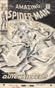 |
JOHN ROMITA AMAZING SPIDER-MAN #71 COVER (SOLD FOR $220K!) |
Auctions
 |
Curt Swan - Superman's Girlfriend Lois Lane #105 Cover |
Hakes Auctions
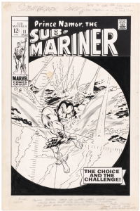 |
SUB-MARINER #11 COMIC BOOK COVER ORIGINAL ART BY GENE COLAN. |


Subscribe to the YouTube Channel.. FREE!
 TDArt Gallery
12 Accepting Commissions
Commission an Artist
For Sale Updates
Classified Updates |
|
Nikolaos K9/7/2025 11:20:00 AM |
|
Will Gabri-El9/7/2025 10:50:00 AM |
|
Athenaeum Comic Art9/7/2025 10:24:00 AM |
|
Rick Verbanas9/7/2025 9:50:00 AM |
|
Peter Venkman9/7/2025 9:25:00 AM |
|
* HoxtonArcade9/7/2025 6:48:00 AM |
|
Dealer Updates |
|
Will's Comic Art Page9/7/2025 10:50:00 AM |
|
RomitaMan Original Art9/7/2025 2:23:00 AM |
|
NSN Art9/7/2025 12:01:00 AM |
|
TDArt Gallery9/6/2025 7:54:00 PM |
|
Anthony's Comicbook Art9/6/2025 3:57:00 PM |
|
Coollines Artwork9/6/2025 3:28:00 PM |
|
|
Become a Premium CAF Gallery Owner & you'll be supporting CAF and also gain access to many services and features not available to standard members.
|