Log In Register
Gary Adubato UNITED STATES
Member Since July 2007
259 Artworks | Watched by 8

TIME WARP #5 p.1 / Vic Catan

2390  Views  -  13  Comments  -  6  Likes

Additional Images

Time Warp #5 p.1 color
Artwork Details
Location: D.C. WAR & MYSTERY Title Pages
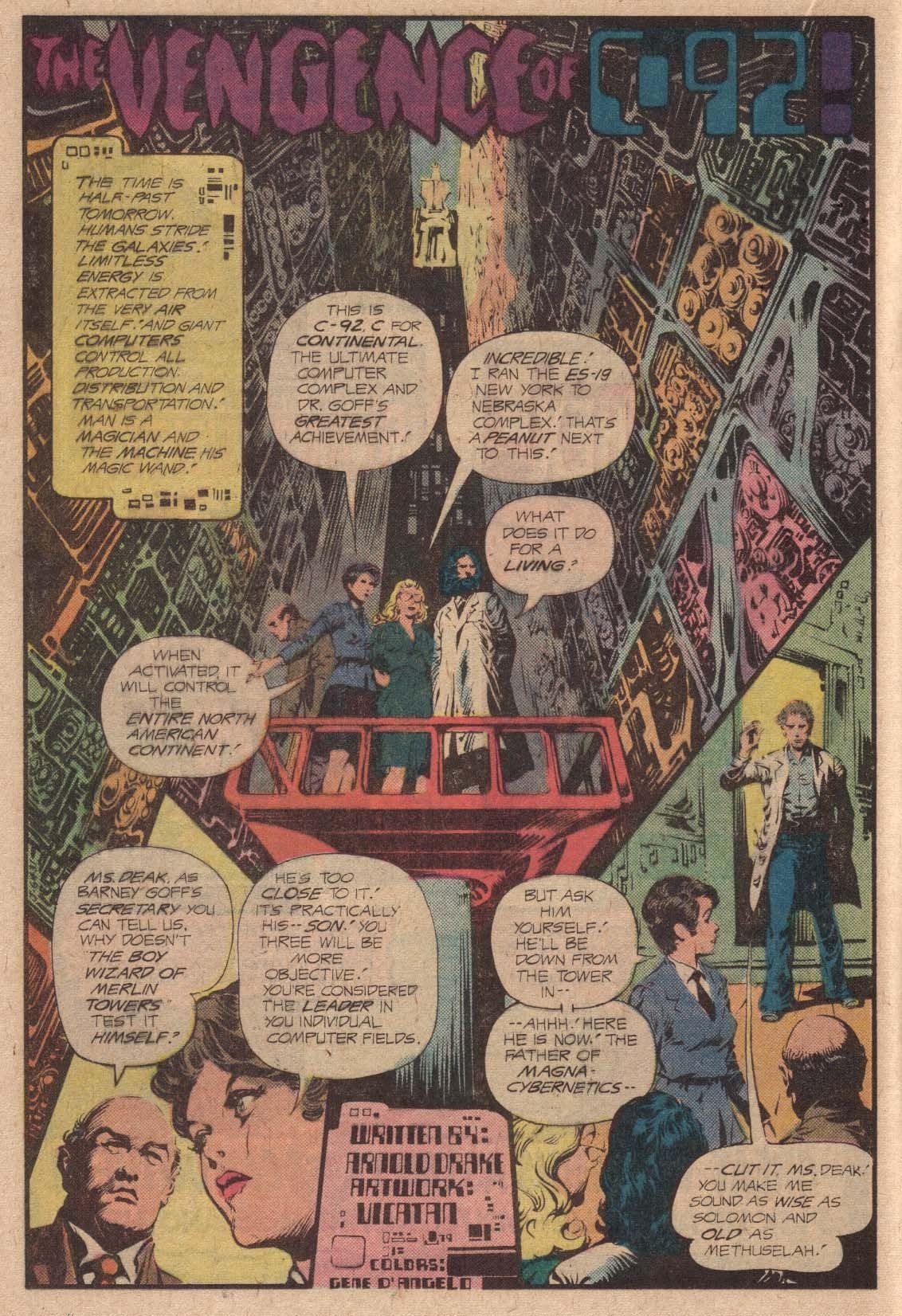
Title: TIME WARP #5 p.1 / Vic Catan*
Artist:  Vic Catan (All)
Media Type: Pen and Ink
Art Type: Title Page
For Sale Status: NFS
Views: 2390
Likes on CAF: 6
Comments: 13
Added to Site: 6/26/2012

Share This Artwork
Description
"The Vengence of C-92". Why do they have editors at D.C., if they don't know how to spell? Anyway, this amazing title page by Vicatan (Vic Catan) is even more gorgeous in person, with Kirby-esque machinery everywhere. Too bad the coloring in the comic destroyed most of the detail...

About The Owner

Member Since: July 2007
Last Login: July 2026
Ebay Id: garyswholesaleauctions
Country: UNITED STATES
On CAF:
Gary's Classifieds
Gary's Want List
Artworks Commented On
Liked Art
Site Activity
Contact Gary Adubato

Login or register for an account to email the owner of this artwork.

Comments on this Artwork

You must be logged in to make comments.
frank x townsondecker Member Since 2006
Posted On 6/26/2012

AWESOME!!
Timothy Finney Member Since 2006
Posted On 6/27/2012

I was going to write about how your comment would force me to (ahem) AVEANGE Joe Orlando's honor, but let's just say that Vic Catan's splash is awesome and let bygones be bygones.
Gary Adubato Member Since 2007
Posted On 6/27/2012

Timothy Finney wrote:
" I was going to write about how your comment would force me to (ahem) AVEANGE Joe Orlando's honor, but let's just say that Vic Catan's splash is awesome and let bygones be bygones.  "
No need to AVEANGE his honor, since I owned this piece for more than 15 years before I even noticed the spelling error! Since Vic did both pencils and inks, maybe by the time the editors got a look at it, they decided it would be a mess to try to fix it?
Steven Dilworth Member Since 2012
Posted On 3/8/2025

Gary Adubato wrote:
"  No need to AVEANGE his honor, since I owned this piece for more than 15 years before I even noticed the spelling error! Since Vic did both pencils and inks, maybe by the time the editors got a look at it, they decided it would be a mess to try to fix it?  "

They had to leave the A out.  The title barely fit as it is.  It was an executive-level decision, I'm sure!

Matt C Member Since 2015
Posted On 12/30/2015

Killer Vicatan page - one of the most underrated artists
David K Member Since 2008
Posted On 2/2/2020

Masterpiece

Gary Adubato Member Since 2007
Posted On 2/3/2020

David K wrote:
"  Masterpiece
 "

Yes, most of the artwork done by the Filipino contingent for DC in the late 70's and early 80's is just outstanding.  These were people who were working for a tiny, tiny page rate -- and usually doing BOTH pencils and inks. There are a few of us who have been "caretakers" of these pieces on CAF:  Heidjer Staecker and Steve Kriozere just to name a couple.

George Hagenauer Member Since 2005
Posted On 4/30/2020

That is pretty amazing- I have a smal lcolelction of misspelled titles !

Gary Adubato Member Since 2007
Posted On 4/30/2020

George Hagenauer wrote:
"  That is pretty amazing- I have a smal lcolelction of misspelled titles !
 "

Yes... an "ERROR PAGE"... If these things were coins, they'd be worth ten times as much.  Not to me, though.  I just love the time, skill and attention to effort these men gave to their work.  Wish it was published in Black and White sometimes since some colorists buried the detail.

Will K Member Since 2006
Posted On 4/3/2022

I have a couple pages from this story.  Who can argue that the coloring couldn't have been improved ??  Vic Catan and lots of other Filipinos carried a lot of the weight for DC's horror and war titles.

Steven Dilworth Member Since 2012
Posted On 10/7/2023

I don't know why I only bought one issue of Time Warp, because I liked it so much, and it was number one.  It, too, had coloring that seemed 'funky' and killed the inking.  I got the feeling they were trying something new with the color separation.

Either way, this is freakin' beautiful page.

Gary Adubato Member Since 2007
Posted On 10/8/2023

Steven Dilworth wrote:
"  I don't know why I only bought one issue of Time Warp, because I liked it so much, and it was number one.  It, too, had coloring that seemed 'funky' and killed the inking.  I got the feeling they were trying something new with the color separation.
Either way, this is freakin' beautiful page.
 "

Steven,   You have excellent taste....  :-)

Max Comic Box   . Member Since 2006
Posted On 1/20/2024

Wow super cool!

You must be logged in to make comments.